Some quick notes on exhibitions visited so far in 2019

The Tourist has been shockingly remiss so far this year in documenting his adventures in the visual and plastic arts. Some plagiarised comments on the I Am Ashurbanipal survey of Assyrian art at the British Museum aside, I have failed to document any other exhibition visits. So, for the sake of completeness, here are some brief comments lest I forget. Sorry reader. This is for me not you.

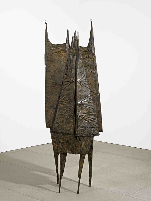
Figure, Totem, Beast: Sculpture in Britain in the 1950s – Tate Britain – 4th January, 2019 – ****

One of my favourite periods. At the intersection of figuration and abstraction. The curators showing the anxieties that plagued society and Western art in the aftermath of the horror of WWII and with the Cold War hanging over it. New materials and processes combined to create sculpture both brutal and beautiful. Some real heavyweights here. Henry Moore, Jacob Epstein, Elizabeth Frink, Eduardo Paolozzi, Reg Butler, William Turnbull. alongside lesser known names for me such as Kenneth Armitage, Bernard Meadows, FE McWilliam, Geoffrey Clarke, Louise Hutchinson and Luciano Minguzzi. And a reminder that Lynn Chadwick was a genius. And how influential this generation was across the world.

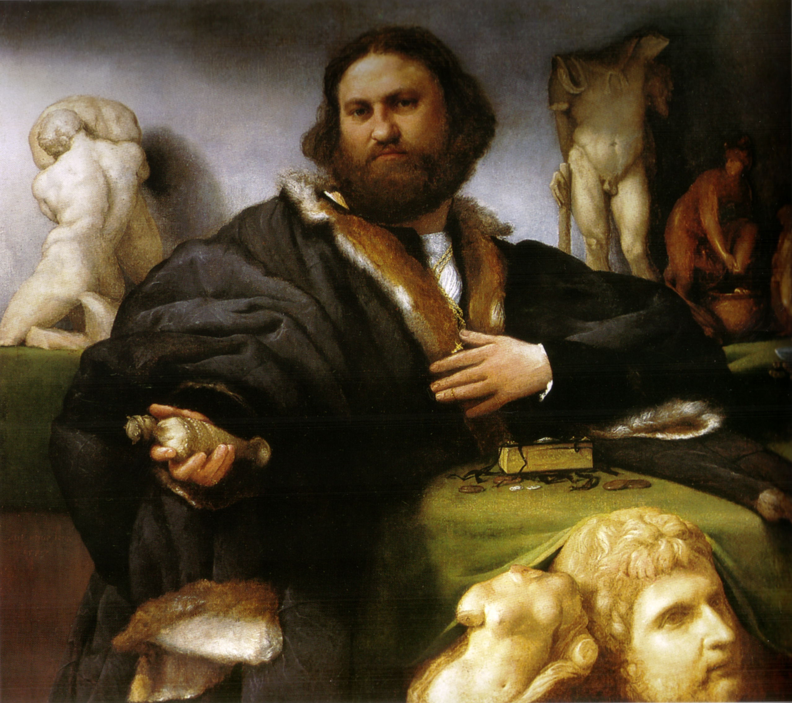
Lorenzo Lotto Portraits – National Gallery – 10th January, 2019 – ****

Lotto (1480-1556/7) may have have been lumped in with the Venetians but he got about a bit depending on who commissioned and paid him (Treviso, Marches, Rome, Bergamo, Ancona, Loreto). High Renaissance, never Mannerist but his portraiture evolved through time. Influenced by Giovanni Bellini, early portraits followed the classicism of Giorgione, then the psychological insight comparable with Antonello de Messina, later on more dramatic like Corregio. Forgotten then rediscovered at the end of the C19. Portraits are intense and self aware and often contain clues and insights into the position and status of the subjects. Not a happy chap based on his correspondence. Pointless addition of old stuff similar to items in the portraits for no discernible reason other than padding out the 30 paintings.

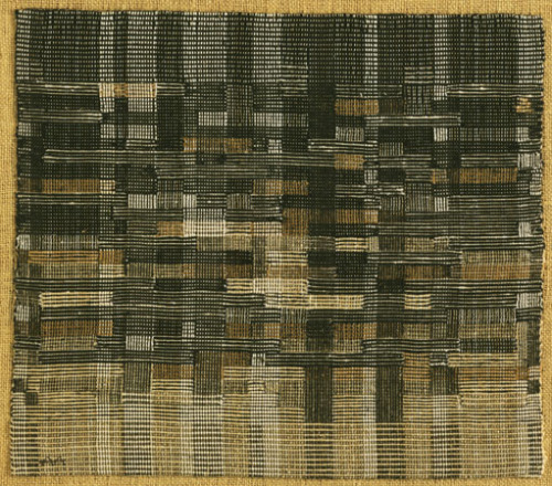
Anni Albers – Tate Modern – 17th January 2019 – ****

Anni Albers combined the craft of hand-weaving with minimalist abstraction. Student at Bauhaus school but discouraged from “fine art” classes so took up weaving. Influenced by Paul Klee and husband Josef Albers. Both educators. Forced out of Nazi Germany. Ended up at Black Mountain College in North Carolina. Influence on Op Art and Abstract Expressionists. Small scale pictorial weavings, large wall hangings, textiles, prints drawings. Studied and inspired by ancient art and technique and folk weaving. “On Weaving” 1965. Different materials, textures, weaves, threads, colours, geometries.

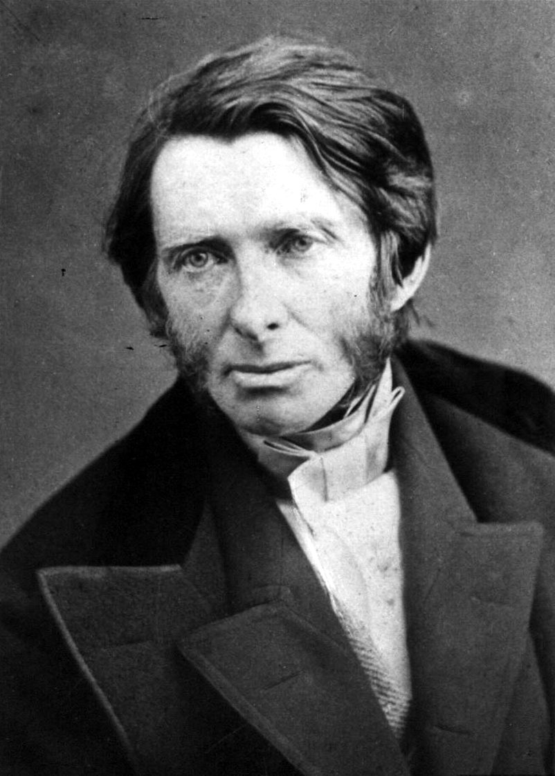
John Ruskin: The Power of Seeing – Two Temple Place – 13th February 2019 – ***

Artist, art critic, educator, social thinker. (1819-1900). In conjunction with Museums of Sheffield which Ruskin created for the people. 190 paintings, drawings, daguerreotypes, metal work, and plaster casts to illustrate how Ruskin’s attitude to aesthetic beauty shaped his radical views on culture and society. Last 25 years retreated into mental illness. Medieval Gothic as inspiration for communal enterprise, makers, guilds, not capitalist production. Detailed, precise drawings and watercolours of nature. Venetian architecture. Landscapes. Collections of objects. Contrast with his religious faith. Influence on Neo-Gothic, architecture, pre-Raphaelites, Arts and Crafts.

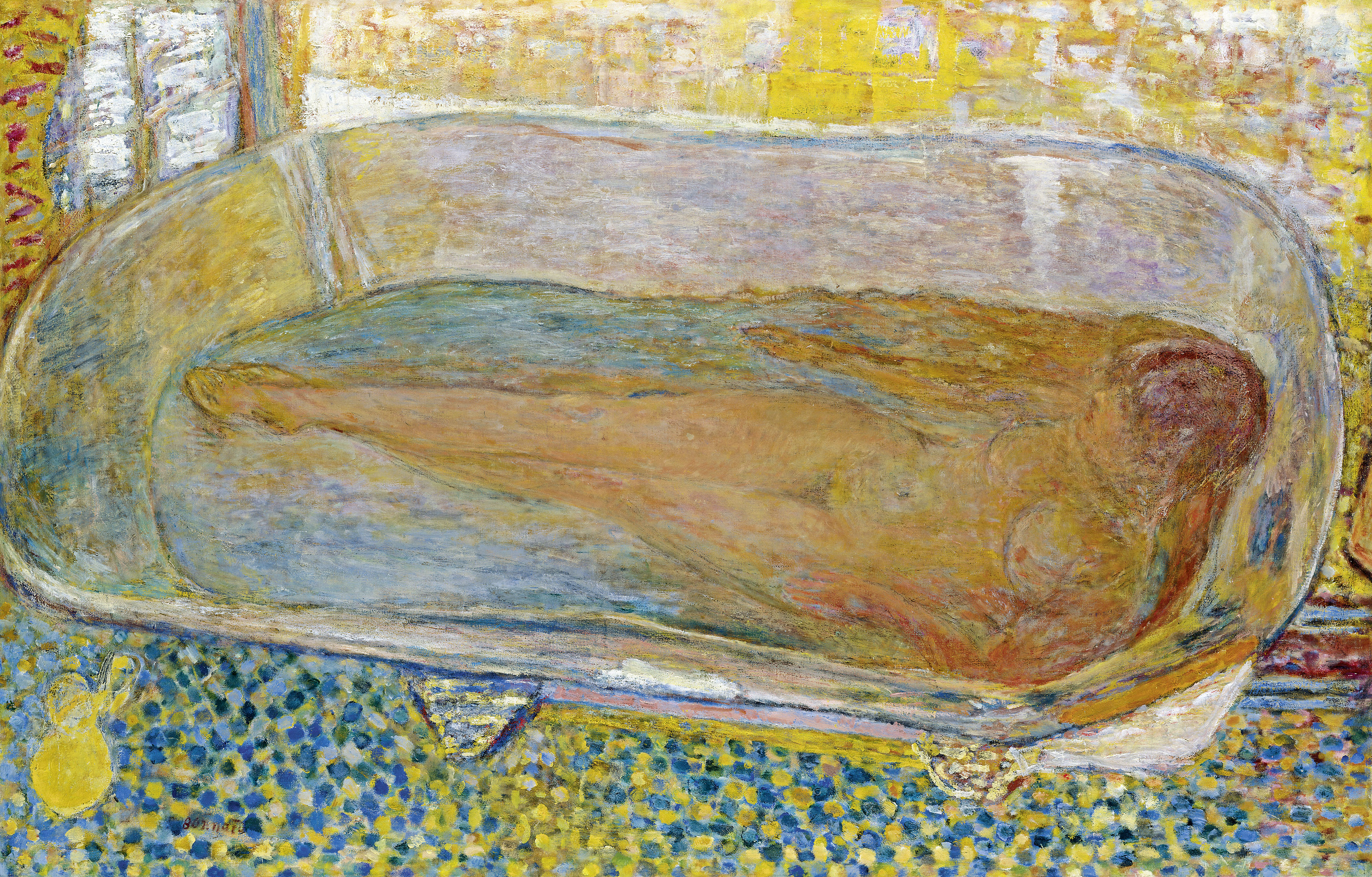
Pierre Bonnard: The Colour of Memory – Tate Modern – 14th March 2019 – ***

1867 to 1947. Bold use of colour though thin not vibrant. Member of Post-impressionist group Les Nabis. Early work influenced by Gaugin and Japanese prints. Shift into modernism. Landscapes, townscapes, portraits, domestic scenes. Popster designs, lithographs and illustrations. Odd angles, cropping and viewpoints. Martha de Meligny was model who became his wife. Always distinct use of colour, small marks, not from life, used photos and note in studio. Intimate, transient subjects. Overworked and sometimes twee or dull.

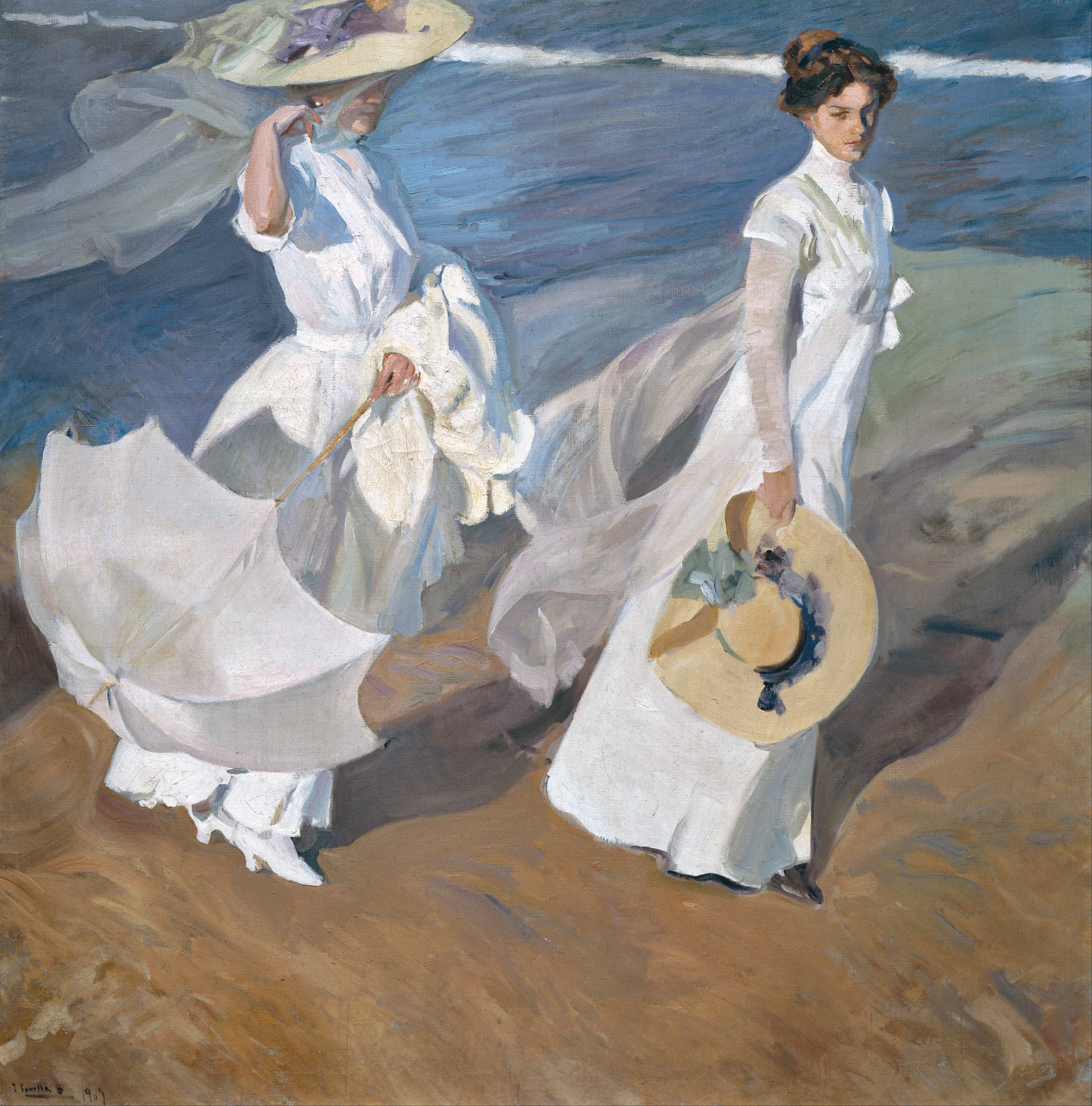
Sorolla: Spanish Master of Light – National Gallery – 28th March, 2019 – ****

Joaquín Sorolla y Bastida (1863–1923). First UK exhibition of Spain’s leading Impressionist in over a century. Known as the ‘master of light’ for his iridescent canvases. 58 works. Seascapes, garden views, beach bather scenes, portraits, landscapes and genre scenes of Spanish life. Very popular in his day, native of Valencia. Child prodigy, worked quickly, excellent draughtsman. Very striking and lovely paint but no real substance and same techniques and effects across the works. Period when he did examine social issues and contemporary cause celebres (Another Marguerite!) however but these are more moral instruction akin to Dickens in paint. Scenes of rural Spain commission for NYC Hispanic Society. Influence of Singer Sargent and back to Goya and Velasquez. The paint equivalent of a very sweet tooth. Lovely but you can have too much in one sitting. The sunlight is exquisite though. Beach scenes, Sewing the Sail and Raisin Factory stood out. Spanish Art moved up and on with Picasso and Dali but Sorolla still very popular in Spain.

Right I feel better for making those notes. A smidgen of understanding for all those poor youngsters about to take exams and revising like billy-o. Just like LD is right now.

I Am Ashurbanipal exhibition at the British Museum review ****

I Am Ashurbanipal King of the World, King of Assyria 

British Museum, 15th February 2019

Crikey. Those Assyrians had a way with reliefs carved in gypsum/alabaster. Even if it was primarily all in the service of terrifying aggrandisement. The King hunting, the King and his soldiers slaying his enemies, the King relaxing with the ladies. It is all about the big man. Seeing these panels adorning the main rooms of the Empire’s palaces, painted in bright pigments, you certainly would have known who was the boss.

The Neo-Assyrian Empire took in most of modern day Iraq, Syria and Iran from 911 BCE to 612 BCE and Ashurbanipal was in the hot seat at its zenith from 668 BCE to 627 BCE. One way or another the Assyrians had been a big noise in the region for the previous 1500 years or so but it is only when the factions came together, and decisively defeated their neighbours, that the Empire was able to take in Cyprus, the Eastern Mediterranean, Eastern Turkey, Egypt and the Persian Gulf. The Neo-Assyrian Empire kicked off with Adad-nirari II but it was Ashburanipal’s daddy, Esarhaddon, the son of a “palace-woman” not the Queen, who did the blood-thirsty groundwork for his favourite son. Even so little Ashurbanipal had to initially share with big brother Shamash-shum-ukin who ruled the rebuilt Babylon.

Whilst Ashurbanipal’s geographical inheritance was vast it needed looking after. First he had to take on the various Empires in Egypt including the Nubians. Then he had to decisively crush the Assyrians’ arch-enemies, the Elamites, and finally he had to take on his own older brother when Babylon rebelled. There is plenty of pictorial and written evidence to show just how cruel Ashurbanipal could be when it came to waging war but, as all you students of ancient history know, you can’t build an empire on brain-dashing alone. You needs brains that stay in heads as well. And this is where the exhibition steps in showing just how learned the great king was, (he had been trained to rule, and to spy and intrigue, from an early age), as he amassed his great Library, oversaw an unrivalled system of communication across the Empire, negotiated treaties and vassalships too hold together his various, proud peoples and turned Nineveh into the greatest city on Earth. He wasn’t troubled by modesty mind as the translations show. It all went to sh*te when he died, isn’t that always the way, but what is on show graphically reveals just how magnificent, (assuming you were on the right side, and ideally you weren’t a lion), it all was at its peak.

Now the British Museum has the lion’s share (haha) of the world’s Assyrian artefacts so curating this exhibition wasn’t too much of a struggle, I imagine. Even so much of this material is not on permanent display, there are plenty of astonishing loans on show and the way the story is told, as is usual at the BM, is superb. Most Assyrian art was lifted in the mid C19, (the Victorians went mad for it), having previous been ignored by scholars in Europe and the US. You can argue about the ethics of such an enterprise, but then again you might also want to consider the centuries before when the exquisite calcite alabaster palace reliefs, lamassu and large scale statuary went walkabout, and you also need to think about the wholesale destruction of what remained in situ by ISIS especially around Mosul. At the end of the exhibition this part of the story is highlighted including the work of the BM in supporting and training local archaeologists to examine and conserve what is left.

Highlights? The small-scale lion hunts, (though I reckon, based on the casual manner in which Ashurbanipal is despatching the beasts, that these reliefs may incorporate a little poetic licence even if they are anatomically perfect) . The Garden Party in the palace of Nimrud. (Let us hope Queen Liz doesn’t take up the custom of decorating the Buck Palace gardens with enemy heads). The wall of cuneiform on clay tablets, a summation of the Knowledge of the day, (a word to the wise – if you want your library to resist a fire, use clay). The copy of the Epic of Gilgamesh, the first ever work of literature. The battle scenes illuminated with modern technology. The “painted” relief similarly enhanced. The lamassu, the human headed bull/lions with wings that stand guard. (How do you move these things? With great care I should imagine and without enlisting the services of the congenitally weak and clumsy like the Tourist). The sphinx of his arch-enemy. Taharqa. The imported Nimrud ivories. The decorated bronze helmet.The tiles. The obelisks. The statue of the big fella himself, alongside his bro. The Elamite art, pedestrian when compared to its Assyrian overlords.

The thing with the reliefs is that not only are they historically and aesthetically pleasing and interesting but they also tell an immediate story. It is this clear, (well, with a bit of help from the curators comments), narrative which makes this art and this exhibition special even if you aren’t normally one for the “dusty” as LD terms most History. Obviously some of the content, the pre-flaying, tongue-ripping, the bone-grinding, the beheading, appeals to our voyeuristic cravings, (don’t worry it isn’t TOO realistic), but it is the muscle, the movement, the energy, the vivid impression of something happening (even if the perspectives are that odd mix of profile and frontal/three-quarter that characterised pre-Grecian art), that makes it special.

And a lesson to all would-be tyrannical despots. If you are going balls-out to subjugate your people, do show an interest in reflecting your “glory” in art. Otherwise no-one will remember you.

Anglo-Saxon Kingdoms at the British Library review *****

Anglo-Saxon Kingsdoms: Art, Word, War

British Library, 30th December 2018

I mean it isn’t all books. There are charters and letters as well. And pottery, coins, art and jewels. But there are a lot of books. Oh my word though, what beautiful books. If you are at all interested in this period of history and the formation of our country, and you like, as Tubbs would say, precious things, (which haven’t been burnt, or otherwise destroyed, notably by the dispersal of monastic libraries in the 1530s), then this is unmissable. The British Library has wheeled out some of its finest treasures from the period, Beowulf, the Lindisfarne Gospels, the St Cuthbert Gospel and Bede’s works, but it doesn’t stop there, with some extraordinary loans from the British Museum, Cathedrals (Canterbury, Durham, Exeter, Lichfield and Rochester), Oxbridge colleges (notably the Parker Library at Corpus Christi Cambridge) and generous institutions around the world (notably France, the Netherlands, Sweden and, maybe best of all, Italy).

The exhibition begins with the first Anglo-Saxons coming to Britain in the 5th century, takes us through the kingdoms that emerged, Kent, East Anglia, Northumberland, Mercia and Wessex, before England was created, as well as the continuing influence of the Danes, and, finally the Normans. We see how the history, art and literature of these Anglo-Saxon Kingdoms developed, and we see the emergence of the English language, (though don’t expect, unless you are an expert in these things, to be able to read the manuscripts. but do listen to the spoken originals and modern translations provided).

The earliest evidence of the language is contained in some cynic inscriptions and a Kentish law code in the first room, Origins. My first highlight though was the unique Spong Man urn lid from the 5th century, he looks so crestfallen, but then again so might you if you were sat atop someone’s ashes. The St Augustine Gospels from the late 6th century are something special, but the Moore Bede from the mid 8th century, copied out soon after the Venerable’s death at his own monastery Wearmouth-Jarrow, is a jaw-dropper. This is the Ecclesiastical History of the English People, the page on show tracing the journey of St Augustine, in letters. The script is pretty dense but this is basically the beginning of our written history.

The second room, Kingdoms and Conversions, has some exquisite jewellery from, amongst others, Sutton Hoo and the Staffordshire Hoard, but once again I was drawn to the scripts. The fragment of a letter from St Cyprian, bishop of Carthage, possibly from the late 4th century, brought here by Abbot Hadrian, various charters, letters and rules from the 7th and 8th centuries, the beginnings of our systems of law, and the Book of Durrow from c. 700 with its various decorative influences. These are trumped though by the beautifully preserved Echternach Gospels, maybe from Ireland, maybe Northumbria, maybe Echternach itself in Luxembourg, the even more spectacular Lindisfarne Gospels also c. 700, and, drum roll please, the Codex Amiatinus.

OMG. Now even if your are some bored teen being dragged around by your pillock of a Dad I defy you not to be impressed by this. First off, it is bloody enormous, 1030 leaves in total. Secondly the page it is open to, a full page illumination of a scribe at work, is just so vibrant and, finally, the history of the Bible itself is just so fascinating. One of three made at Wearmouth-Jarrow in the early years of the 8th century it was taken in 716 by Abbot Ceolfrith and chums to Rome. AC, poor chap, died on the way but in the 1300 years until now it has been cared for in Italy, latterly at the Biblioteca Medicea Laurenziana in Florence. Welcome home then Codex Amiatinus, if only for a short visit. It is the oldest complete Latin Vulgate version of the Bible; only the fragmentary Leon palimpsest is older. It was assumed to be Italian, from the 6th century, until some top-drawer research revealed that it was actually created during Northumbria’s Golden Age.

Take your time surrounded by these gems. There are more treasures to come but this room, for me, was the pinnacle. The next room, Mercia and Its Neighbours, details the rise of that kingdom, through military power and political skill, and the creation of a third archdiocese at Lichfield alongside York and Canterbury. Once again the Gospels (Barberini, St Chad, Harley Golden) will draw your eye, as will the Lichfield Angel if you have not see it before, but I was particularly interested in the various charters, from King Aethebald dated 736 and from King Offa dated 783, and the evidence of links with Charlemagne in mainland Europe. It made me reflect again on how the powerful choose leaders primarily to validate their own appropriation of land and capital, and spend an awful lot of time arguing with each other to secure leaders more amenable to their ambitions.

The Favourite, Richard II, C18 British history, Brexit newsflow, this exhibition. All entertainments and/or learnings on the Tourist’s plate in the last couple of weeks, all variations in part on this theme. Similarly the next room, The Rise of the West Saxons, which charts the ascendancy of King Alfred and his successors and the idea of an England. Now the Tourist cheerfully confesses that he is addicted to The Last Kingdom, the TV series now in its third season, based on Bernard Cornwall’s The Saxon Stories novels. Now it is a bit daft at times, and cheesy, and the main protagonist, Uhtred of Bebbanburg, and his mates, do, implausibly, get about a bit. He may be fictional but many of the other players on show were for real and, in David Dawson playing Alfred, it has a top-notch actor showing his class. Like I always say, take your education wherever you can.

By 880 Alfred had made peace with the Danes, who were increasingly “naturalising”, and promoted a cultural leap forward, with the development especially of the English language. This legacy continued through grandson Aelthelstan, the first King of England from 927 to 939, who claimed control of Northumbria and submission from the Scots, Welsh and remaining Britons. Aethelstan centralised government, expanded the reach of the law, founded places of religion, (his personal psalter, a pocket gospels, is on display), and got stuck into European politics. So there you are little Englanders. Even when little England first became a reality we were tied to that pesky Europe. It will never go away whatever you may think. BTW, in my final, I promise, “look at me” moment in this post, I walked past the very spot where Aethelstan was crowned not a few hours ago. Outside the police station in Kingston-upon-Thames. I kid you not.

So no surprise that I took a long look at the Council of Kingston document in the exhibition which dates from 838 and confirms the alliance between Ecgberht, Alfred’s grandad, and the Archbishop of Canterbury. The beautiful Stockholm Codex Aureus, on loan from, er, Stockholm, will also detain you but it is the famous historical documents, the Anglo-Saxon Chronicle, Asser’s Life of King Alfred, the treaty between Alfred and Guthrum the Dane, a translation from Alfred himself and the Foothill Letter from the early 10th century, the oldest letter in the English language, that require careful examination. History. Boring. Think again.

Highlights of the next room, the self-explanatory Language, Learning and Literature, include the only surviving manuscript of Beowulf, the greatest Anglo-Saxon literary relic, the Junius Manuscript, 1000 lines of Old English verse, the Old English Hexateuch, the first six books of the Bible and the Old English translation of Boethius’s Consolation of Philosophy. If your interest extends to natural sciences, medicine and mathematics then you will be fascinated by this section.

The next room, Kingdom and Church, is focussed on the elevation of the Church under King Edgar, Alfred’s great-grandson. The highlight here comes at the end with the display of the Utrecht (825), Harley (first half 11th century) and Eadwin (c. 1150), Psalters displayed side by side. Seeing how one was copied into another into another is just amazing. Prior to this though the room is stuffed full of dainties, notably the Benedictional of Aethelwold from the 970s, the Vespasian Psalter from the second quarter of the eighth century, (the earliest Biblical text in the English language), the Boulogne and, especially, Trinity Gospels and the Winchester Troper.

The final room, Conquests and Landscapes, looks at the return of the Danes under Cnut and then the Norman Conquest, culminating with the BL’s Domesday Book and a short video.

I could go on and on but no purpose would be served in this. I have my catalogue accompanying the exhibition and can safely say, as one who regularly purchases such items, (and doesn’t always look at them immediately), that this is one of the most informative, involving and attractive I have ever seen. Even the short exhibition guide is a mine of information and the notes to the exhibits themselves could not be clearer.

All in all, and given the potential bone-dry bear-trap of a subject, early English history, and exhibits, in a word books, (though there is, as I said, plenty of other material on show here), this is a triumph. Maybe not enough to persuade those for whom history and manuscripts are anathema but if you have any interest at all, from any angle, don’t hesitate. No need, as ever with these things, to dutifully read every note or take in every exhibit. But if you can’t find at least a few items that command your attention I would be amazed.

It is on until 19th February. Usual rules apply. First thing in the morning. Sunday afternoon or the later slots on Tuesday when this opens until 8pm. And avoid the last week.

Space Shifters exhibition at the Hayward Gallery ***

Space Shifters

Hayward Gallery, 21st December 2018

Here is another one of the cleverly constructed exhibitions from the Hayward team which brings together a variety of visual works (20 in total), in different media, from different artists which delight, intrigue and entertain. The works span some five decades, (with some new commissions), are informed by a minimalist aesthetic and look to explore our perception of space. Materials are pure and often translucent, indeed many of these works relied on advances in material technologies to become possible, forms and lines are sharp and clearly defined. There is a bit of reflection going on, as in mirroring not contemplation. If art is the manipulation of light then this is, definitively, art.

Before the refurb the gallery offered us Psycho Buildings in 2007, Invisible in 2012, Light Show in 2013 and The Human Factor in 2014. There may have been others the Tourist failed to remember. They pack in the punters, make you think and maybe smile, at least whilst you are there and make good use of the now smartened up Hayward space. Perfect for the Instagram generation.

And that, at the risk of coming across like the old buffer I am, is part of the problem. Whilst individually there are some fine works on show here, the overall effect is a little numbing and, once the novelty has passed, not entirely fulfilling. Still if you take the exhibition as you find it you will enjoy it, no doubt about that, and there maybe one or two artists whose work is sufficiently interesting, work that really does change and engage with the space around it, to make you want to seek out more.

For me those artists would have to include Richard Wilson and his installation 20-50 originally created in 1987. Now there was a bit of a queue to see 20-50 and I confess that we, for on this visit we were a large tribe, the SO, BD, LD, MSBD, TTEW and MSGS alongside the Tourist as expedition leader, frankly didn’t have time. But you must make time, for if you have not seen it then you are in for a treat. The work is doing something of a tour before it sets up in its permanent home in Tasmania where I gather a gambling millionaire has bought it. Now it used to live for many years in the various Saatchi Gallery incarnations (see above) so if you are a contemporary art buff chances are you have seen it. Whilst the outcome will vary according to its location, its function, material and meaning is essentially fixed. Wilson basically floods a room with used engine oil then builds a pier over it so that the viewer is surrounded by the oil on three sides. The mirrored reflection from the utterly smooth, viscous, velvety, unctuous surface makes it feel like you are in a doubled space, stretching down into infinity and revealing every architectural detail of the space above the surface. That surface is dark, unyielding and perfectly flat. The temptation to chuck something in is overwhelming but then so is the desire to preserve this unbroken surface. Oh and the smell is overpowering. This you won’t forget in a hurry.

Mr Wilson is all about intervening into architectural spaces. Inversions, distortions, changing scale and material. He is a big noise in contemporary British sculpture. If you like this check out Slipstream in Terminal 2 at Heathrow, Shack Stack at Grosvenor Waterside, Square the Block on the LSE at the corner of Kingsway and Sardinia Street and A Slice of Reality at Greenwich Peninsula. Readers elsewhere might find one of his public works closer to home. I would loved to have seen Turning the Place Over, Hang on Lads I’ve Got a Great Idea and Queen and Gantry. His work succeeds thanks to the audacity of the ideas, its scale, the way it questions our notions of space and function, the way it disorientates our senses, its humour and the skill and process required in its execution.

Nothing else in the exhibition really comes close. Anish Kapoor’s trademark Non-Object (Door) reflects and distorts the space and things around it including us, like an old style Hall of Mirrors at the funfair. It’s amusing though not as thoughtful as Sky Mirror, Blue on the roof of the gallery which concave, selected surface inverts and saturates in blue the reflected sky above. (The Sky Mirror outside Nottingham Playhouse is another example of the beautifully simple idea. Apparently it is Nottingham’s favourite landmark thus proving the point that contemporary civic art can induce pleasing reactions beyond the purely aesthetic).

Jeppe Hein’s 360º Illusion V is comprised of two rotating mirrors placed at right angles which creates curious double reflections of us and others. Perfect for Homo sapiens who love gawping at each other. Polish artist

Alicja Kwade’s WeltenLinie is an even more satisfying illusion, a steel frame partially filled with double sided mirrors and carefully placed objects which really does mess with our heads. Punters can and do walk into the mirrors, the artificial objects on the floor can and do change shape and colour. You know how it is happening but that doesn’t making it any less fascinating or amusing. Her Medium Median was shown at the Whitechapel Gallery a couple of years ago and was, in a different way, as equally arresting as an installation.

Monika Sosnowka is another Polish artist whose work here, Handrail, subverts interior architecture, here the humble handrail, and is wryly amusing. Larry Bell is an artist I have come across before and his Standing Walls is at the mainmast end of large scale minimalist sculpture. Literally for the purist. As is Robert Irwin’s classic, and slightly menacing, Untitled (Acrylic Column).

Roni Horn is one of a more recent generation of minimalist sculptors who uses glass, here to make a cylinder Untitled (“Everything was slipping as if the universe were a mistake”), which is both simultaneously heavy and light and, for all the world, looks like a pool of water. One of my favourites. As was Ann Veronica Janssens Magic Mirrors (Pink and #2 and Blue). Each is comprised of a shattered pane of safety glass encased by two normal glass sheets lined with filters that allow light to pass through selectively and thus throw shadows on the wall with different, changing and blurring colours. Really captivating as the number of selfies being taken attested to. I will need to check out more of her work.

A century of modernism, and now several decades of minimalism, in art, architecture, design, fashion, graphics and so on, means that we are now all pretty much programmed to embrace this aesthetic. There may be a generation that prefers velour and Toby jugs but they are on the way out. Glass, steel, perspex, resin, artificial light, saturated colours, our world is surrounded by these materials. It is work we work, where we study and where we live. We see, touch and feel spaces and objects informed by mathematics and not messy or maximalist organics. Is this what makes these art works so seductive and will this ever change? Search me.

Modern Couples at the Barbican Art Gallery review ****

Modern Couples: Art, Intimacy and the Avant-Garde

Barbican Art Gallery, 15th November 2018

Here’s another smart bit of curating from the team at the Barbican, in collaboration with the Centre Pompidou-Metz here led by Jane Alison. Track the history of modernism in art – not just painting, but sculpture, photography, design, print, literature and architecture, with a nod to the commercial where appropriate – through the couples which created it. 

The net has been cast wide, both in terms of the number of artists involved, 46 partnerships in total, the themes that are explored, including love, sex, passion, politics, collaboration, abstraction, communication, and the nature of the relationships, straight, gay, bi, polyamorous, homoerotic, controlling, liberating, disturbing, equal, unequal, conventional, unconventional. 

With a few exceptions there isn’t a great deal of material here to map each couple but the quantity, and the clear and direct tone, display and messaging, makes up for that. The private connections are fascinating in themselves but also shed a lot of light on how art and artists have changed society since the turn of the C20.

There are a fair few relationships that you might expect to appear, the Bloomsbury Group permutations, Frieda Kahlo and Diego Rivera, Georgia O’Keefe and Alfred Stieglitz, Ben Nicholson and Winifred Nicholson and then Barbara Hepworth, Alma Mahler and Gustav and Oskar Kokoschka (who really couldn’t let go), Jean Arp and Sophie Tauber, Lucia Moholy and Laszlo Moholy-Nagy, the Delauneys. And then there are a few which I didn’t anticipate. The Aaltos, Gustav Klimt and designer and businesswoman Emilie Floge, Nancy Cunard and Henry Crowder. 

It is hard not to be drawn into the stories of those women artists whose contributions, the exhibition argues, may not have been justly recognised in the shadow of their more “famous” partners, Camille Claudel and Rodin, Maria Martins and Duchamp and, arguably, Dorothea Tanning and Leonora Carrington with Max Ernst. The fate of Dora Maar, Picasso’s early muse, and Unica Zurn, the “inspiration” for Hans Bellmer, will likely disturb. A lot of these fellas don’t come across well here. 

Most interesting for me. The intense friendship between Lorca and Dali. The portraits of Romaine Brooks, (her lifelong partner, and oft-subject was the writer Natalie Barney), entirely new too me, Lee Miller, during her years with Man Ray and Roland Penrose, she is a cast-iron genius though here, as elsewhere, the submission is unsettling, and, best of all the extraordinary creative partnership of constructivists Varvara Stepanova and Alexander Rodchenko. Now they were the future, and looking at their work, they still are. And as far as I can see they were genuinely equal with no hint of the f*cked up sadism of the surrealist fringe. There they are above in the 1920’s looking pretty cool. 

Well worth a look. It may end up being more biography than art and it is probably fair to say, like most of the Barbican’s exhibitions, it is designed for the slighter, and maybe outre, attention span, but, let’s be honest that is sometimes what the head, and feet, requires. Don’t expect to be bowled over by amazing art, but do expect to learn something. Tie it in with something else – it’s not like there isn’t plenty going on at the Barbican. 

Mantegna and Bellini at the National Gallery review *****

Mantegna and Bellini

National Gallery, 11th November 2018

11th November was turning into a very busy day for the Tourist. Fresh from the heady Edward Burne-Jones phantasmagoria at Tate Britain and a proper Sunday lunch, it was off to the National, now solo, for these Old Masters, before rounding off at the Barbican for a bit of choral pleasure (I realise that sounds a little dubious).

Anyway this double header was everything the Burne-Jones wasn’t. Indisputably, vibrantly, thrillingly, alive. Now I know that endless bible extracts, with Jesus suffering and the Virgin Mary looking beatific might not strike you as the stuff of reality, any more than the silly romantic legends that make up the pre-Raphaelite world, but trust me they are. The religious settings, like the music of the time, were just the templates to tell more human stories as well as create work of astonishing beauty. If the Church is the only patron, or rather religious images are what wealthy patrons require, then that is what artists will provide. Can’t buck the market. For me this very restriction on subject is what creates the conditions for supreme innovation.

And in this exhibition we get the ultimate BOGOF. In 1453 Andrea Mantegna, already an established painter, trots in to Padua to marry Nicolosia Bellini, daughter of the venerable Jacopo, to become the brother in law of Gentile, and, our subject here, Giovanni. Giovanni, a relative novice, picks up on Andrea’s compositional experimentation and fascination with antiquity, and, in time, for me at least, overtakes him. Mantegna in turn harnesses Bellini’s facility with landscape to produce his greatest works when he moves in 1460 to the Gonzaga court in Mantua. Bellini stays in Venice, but even apart they tread similar paths, though with different results. Mantegna’s precise, flinty, sculptural, sharper, masculine, intellectual work contrasts with Giovanni Bellini’s lighter, softer, airier, more lyrical, enigmatic and emotional output. Same subjects and stories. Radically different ways of seeing and showing them

Guess which is which in the The Presentation of Christ in the Temple above? 20 years separate top from bottom. I’ll leave it to you.

This is not the only direct comparison in this superb exhibition. It would be fascinating just to play that game over a few paintings but here they just keep on coming across the six rooms. Some may be familiar to you (from the National Gallery, British Museum or Berlin museums from which they are drawn)  but it doesn’t diminish the wow factor.  Saint Sebastian, The Agony in the Garden, Crucifixions. The curators walk you through how and why the brothers-in-law created their own interpretations, which, for the interested layman is insightful, though you have to make sure, post comparison, you take the time to examine each painting individually. However there are enough individual unique subjects to offset the comparisons and avoid being overwhelmed by the scholarship.

The exhibition opens with a book of drawings. Pretty much all that remains of Daddy Jacopo’s art. We have to assume, given the importance of family and patronage in making and selling art in the C15, that Jacopo will have had a big hand in the direction of the business. He certainly kick-started the expanded artistic ideas that would emerge from the extended family. Alas this is the last we hear of him. Still the eye is probably already alighting on the two Presentations and your first starter for ten. 

What did Mantegna bequeath the next generation of the Italian Renaissance? The rise of the classical theme. The big picture. Literally in his Triumphs (of Caesar) of which just three are shown here (check them out in Hampton Court Palace when they return). Maybe the birth of the individual in art. That he was a master of perspective following in the footsteps of Masaccio and Uccello, and, in a different way, Donatello, is made pretty clear here. 

And Bellini? Colour, back-stories, people you can identify with, even if they were in deserts or on crosses or generally undergoing some sort of taxing trial or trauma. Maybe Mantegna was the more obvious influencer in his day, but Bellini, “the best Venetian painter of the C15”, may have endured for longer. I reckon I can see in him a thread through to Courbet and, eventually, the modernists. 

Mantegna imposes his narrative from without. Bellini’s flows from within. Pretentious w*ank. Maybe but fast forward to the end and compare Bellini’s OMG portrait of the Doge Leonardo Loredan, the cerulean background, the gold and silver impasto cloak, the confident, steely gaze. Perfectly lit. A very formal, contemporary portrait, that also looks timeless. In oil. Which Mantegna never used. Look then at his Minerva Expelling the Vices from the Garden of Virtue, painted in his 70’s. A complex, symbolic, Classical allegory. Intellectual to a tee. Painted for private contemplation not public edification.

Warm flesh. Cold marble. Head or heart. Fortunately in this exhibition you don’t have to choose. 

Edward Burne-Jones at Tate Britain review ****

Edward Burne Jones

Tate Britain, 11th November 2018

Turns out Burne-Jones isn’t quite as awful as I had previously thought. Don’t get me wrong. All that hippy-dippy, fey, dreamy. dusky-toned, doe-eyed, ginger-permed, long-bodied, nymph-y, mannequin-esque, briar-strewn, Arthurian, industrialisation-denying, fake-Medieval, cod-Renaissance daubing is still guaranteed to do my head in. But I will concede that he could draw. Really draw and there are details, even in the worst of the fairy-tale illustrations, that deserve a properly good look.

I can’t change my immediate reaction to art but I can try to explain it to myself. And, if I am honest, with Burne-Jones, and the rest of the original pre-Raphaelites, and their Arts and Crafts and Neo-Gothic mates, it is in part the context in which they produced their art (and design) that winds me up as much as the work itself. As with this exhibition there are elements that I can concede give me pleasure, the colour (when vamped up as in the stained glass for example), the line and form (notably in drawings, textile, church interiors, tapestries) and the belief in the power of the aesthetic. They started off with the right inspiration, the jewels, (and working practices), of the early Flemish and Italian Renaissance, (the clue is in the pre- moniker) and their vaguely humanist intention to eschew purely religious imagery is commendable. But that doesn’t excuse the lifelessness of their subjects and the utter irrelevance of their mythologies. At the end of the day Burne-Jones ended up churning out knights in armour and pretty ladies for the great and good in Victorian society; the fate of many an artist through history for sure, but these chaps ended up as the reactionaries they purported to abjure. 

The kindness of strangers, well friends in this case, may also have had an effect on my viewing. We were a big party, with the SO, who inclines to the hyper-real in art, (though understanding that paint on canvas in two dimensions could hardly be more artificial), KCK who is an admirer, BUD the ever-curious and the Blonde Bombshells, who know their artistic onions. Me banging on about the preposterous narratives in the paintings, creepy friends and family who are persistently featured (after raiding the dressing-up box), the cut and pastes from Renaissance masters, the pointlessness, introversion and body fascism of this obsession with “beauty”, the upper-class, biscuit tin sentimentality, the failure to move on or develop his art, the dodgy androgynous eroticism, the all-round sameyness, would clearly have been border-line patronising. 

Particularly since I could be found avidly staring at many of the works looking for all the world like some-one who might be enjoying them. And as I discovered that Burne-Jones was not the la-di-dah toff I had assumed but working-class and self-taught. And Jimmy Page has pitched in with his Holy Grail tapestries. Which seems apposite. Led Zep were often musically at their very best (Immigrant Song, Stairway, Achilles Last Stand, No Quarter) just as lyrically they were off with the fairies. 

What was most interesting then? The early drawings, Going to the Battle, Buondelmonte’s Wedding, the stained glass from the V&A (if you ignore the pretty faces), the various pencil studies, the bodycolour nymphs enhanced with metallic paints, King Cophetua and the Beggar Maid, The Morning of the Resurrection, Love and the Pilgrim, the Lucien Freud-like portraits, details of the Briar Rose/Sleeping Beauty and Perseus/Medusa series, The Fall of Lucifer and certain of the tapestries, like the Adoration above. Though I can’t say I “liked” these works, admired might better cover it. And much of the rest still annoyed me. 

So Burne-Jones. Sublime or ridiculous? You decide. For me he was both. Simultaneously. Conservative Victorian or symbolist visionary? Again a bit of both. Style over substance? Certainly but that is exactly what he and his peers set out to deliver I’ll warrant. I can see why people like Burne-Jones’s art. I just can’t quite see exactly what it is they like. It is, at least in the big, showy, famous works, very, very detached from any reality, yet seems to be prized by many for its verisimilitude. I have a feeling you could use Burne-Jones as the ultimate artist in one of those sociology attitude tests. All that useless beauty as Elvis (C not P) once said. 

Me? I would still rather spend a couple of hours with one van Eyck. More beauty. More skill. More reality. More meaning. More life. 

I can’t fault the curation though, Surprisingly this is the first full-scale survey in London of EBJ since 1975, amazing given his popularity, and the Tate has built handsomely on its own catalogue to give us the whole shebang. Downstairs in the tomb-like Manton St galleries. Which doesn’t suit every artist but sets EBJ’s sleepy melancholy and false colour palette off to a tee. There is a kind of cumulative surrender in seeing so many, large-scale, paintings hung together. 

And can anyone tell me who the bloke with the chiseled features and scary eyes is who keeps cropping up? 

Hogarth’s Progress at the Rose Kingston review ***

william_hogarth_-_self-portrait_-_google_art_project

Hogarth’s Progress: The Art of Success and The Taste of the Town

Rose Theatre Kingston, 21st October 2018

South West London was a popular place for the cultural, liberal, metropolitan elite in the first half of the C18. It still is. Hogarth, Horace Walpole, David Garrick, Henry Fielding, Alexander Pope, Henrietta Howard (the King’s mistress no less), Lord Burlington, Richard Steele, Paul Whitehead, Lady Mary Montagu, John Beard, Kitty Clive, Peg Woffington, James Thomson, John Moody, GF Handel (for one summer), Stephen Duck, John Stuart, Thomas Twining, Augustin Heckel. Oh, and early on in the period, no less than the Queen herself, Anne, at Hampton Court, following in the footsteps of William and Mary. Royalty and the Thames is what made it desirable,

OK so I can’t pretend I had heard of all of these luminaries but some of the big names, Walpole, Garrick and Fielding, play a big part in Nick Dear’s brace of plays about one of the area’s most famous residents, Hogarth himself. The first play, The Art of Success, premiered at the RSC way back in 1986, with Michael Kitchen and Niamh Cusack starring (seen last year on this very stage in the marvellous adaptation of Elena Ferrante’s Neapolitan Novels (My Brilliant Friend at the Rose Theatre Kingston review ****). This tells the story of Hogarth’s early years carousing his way through Georgian London with Henry Fielding and their mates, Frank and Oliver. The new, companion, piece, The Taste of the Town, revisits Hogarth, now in Chiswick, at the end of his life (1697-1764). His house is now supported by the Hogarth Trust, owned and run by LB Hounslow and can be visited most afternoons. Worth a peak especially if you take in he neo-Palladian beauty that is the recently refurbished Chiswick House just round the corner. And, once in your life, you have to see the flamboyant spectacle that is Strawberry Hill House. This is why interior designers are best avoided.

Now for those who aren’t familiar with William Hogarth, he was a painter, printmaker, social critic and cartoonist in the first half of the C18. This period saw a huge increase in the wealth of Britain, (in full union with Scotland from 1707), built on trade, specifically trade in people, specifically slavery. With this came the rise of the liberal Whigs who took power from the Tories in 1715 and drew their support from the new industrial and merchant classes. It was a period of vigorous political debate. At least it was if you were rich. If you were poor …. well you were still f*cked over as always. Anyway Hogarth and his mates were dead centre in this cultural maelstrom, specifically in criticism of the great and good. Journals, newspapers, pamphlets, clubs, all mushroomed. And these boys were bad to the bone.

Hogarth himself came from a less privileged background, enough to get an apprenticeship as an engraver, but precarious enough to see his teacher Dad have spels in the debtors prison. This is where his satirical edge was sharpened. His morality tale “comic strips”, such as A Harlot’s Progress and A Rake’s Progress, were dead popular at the time and have remained so ever since, and sort of defined the entire genre. Yet he was also a renowned painter, largely society portraiture that being the mode at the time, and the tension between his “popular” and his “high” art is one of the themes that Nick Dear explores in the plays.

Dear also doesn’t hold back on portraying the seedier side of Georgian life. The Art of Success kicks off with Hogarth (Bryan Dick), Fielding (Jack Derges), Frank (Ben Deery) and Oliver (Ian Hallard) lashed up after a meeting of the Beefsteak Club and contemplating their next move, which is going to involve sex for money I am afraid. There is a lot of this sort of thing going on in the first play set in the 1730s. Indeed Hogarth’s relationship with prostitute Louisa (Emma Cunniffe), and its discovery by his wife Jane (Ruby Bentall) forms a major part of the plot of this play, such as it is. Alongside his encounter with murderess Sarah Sprackling (Jasmine Jones) who was the subject of The Harlot’s Progress and who seeks to wrest control of her image back from Hogarth after he draws her in prison. This question of who “owns” a representation in art, the observer or the observed, is another central theme of the play.

In the hands of Antony Banks as director, alongside period costumes and a striking, if s;lightly unwieldy, set from Andrew D Edwards, some fine video work from Douglas O’Connell, lighting from James Whiteside, sound from Max Pappenheim and music from Olly Fox, scene after scene unfolds with distinctive verisimilitude. The Queen, Caroline of Brunswick (Susannah Harker complete with comedy German accent) gets a look in, and reveals herself ken to get inside Hogarth’s britches, as does Prime Minister Robert Walpole (Mark Umbers) who reveals himself keen to see a liaison between Sarah and Jane (it’s a long story). Walpole indeed cuts a deal with Hogarth to push through the copyright deal that WH craves to stop his work being ripped off. Yet, alongside Fielding he rails against the political censorship that Walpole introduced to the theatre, a process that persisted until 1968.

This personality parade though gives an inkling into the plays’ problems. The comedy smut becomes a little wary after a while and the crowbarring into the script of biographical and historical fact after fact leaves little room for any change of pace or tone. There is the vulgar, which is fun, or there is the art history lecture, which is a little less so, once you know what is coming. The repellent power of men over women in the Georgian booms out through both plays but to no great end, as the strands are never pulled together..

The second play with Hogarth now retired to Chiswick, and railing against rivals like Sir Joshua Reynolds feels even slighter in some ways. Hogarth is now played by Keith Allen. One word. Irascible. Perfect casting. Jane Hogarth, now played by Susannah Harker, puts up with his grumpiness and abuse, but is a little tired of the suburban life. Hogarth and his mother-in-law, Lady Thornhill, the majestic Sylvestra Le Touzel initially in full on Lady Bracknell mode, do little to disguise there dislike. Things perk up for Hogarth however when old chum, near neighbour and charming egoist David Garrick (Mark Umbers) comes to call and the two go on a road trip. Of sorts. On foot. Down the Thames. Drink intervenes and Hogarth swans off to visit another local celeb, the ostentatious Horace Walpole (Ian Hallard, who seems to be having a lot of fun) who has dissed Hogarth’s painting skills in his stab at classicism Sigismunda (which is. to be honest, pretty limp). They argue, they make up. More misadventure etc, etc.

It’s not that I didn’t appreciate the history lesson. I really did. It’s not that I wasn’t impressed by the acting, notably Bryan Dick, (who impressed in Great Apes and Two Noble Kinsmen recently on stage and as Joe Orton on the box), and Keith Allen, as the main event. And many of the scenes are, of themselves, striking and entertaining. It’s just that the plot, and the arguments it seeks to explore, seem to have been welded together from the events and the personae that are portrayed, and the bawdy and the pedagogic never quite gel.

There is a book, which we seem to have acquired, which you can find in most National Trust shops. Scenes From Georgian Life by Margaret Wiles. It is a collection of period caricatures and cartoons, including some from Hogarth. From the tamer end of his oeuvre for sure. We wouldn’t want to upset the gentle, middle classes. Nick Dear’s two sketch plays are muckier and cleverer but ultimately not that much more impactful.

The Habit of Art at Richmond Theatre review *****

richmond_theatre_2013-09-23_20-19-48

The Habit of Art

Richmond Theatre, 19th October 2018

There are a handful of plays that I regret not seeing when they first appeared. Not those I wish I had seen, That would be a very long list and cover those periods where I was not putting the required viewing effort in, being too consumed by work and/or drink. No I mean those where I toyed with the idea of going but didn’t get round to it one way or another. The Habit of Art is definitely one of those. I can see why some might get irritated by the voice of Alan Bennett. Not his actual voice of course. Surely everyone loves that unmistakable broad Yorkshire drone. No I mean his theatrical voice with its now ever-present risk of self-parody.

The Habit of Art, from 2009, along with The History Boys (2004), The Lady in the Van (1999) and The Madness Of George III (1991) must all surely rank somewhere near the top of the pile of great British plays written in the last three decades for all the pervasiveness of the last three.  The Habit of Art “imagines” a meeting between WH Auden and Benjamin Britten in 1973 as a departure for an investigation not just into their specific art and lives but into art and theatre as a universal. Right up my street. And best of all for me at least, Benjamin Britten, for all his flaws, which are far from concealed here, is one of my favourite composers.

My only concern then, perhaps, was the cast. The NT run saw Alex Jennings, near full time Alan Bennett impersonator, take on the role of BB with the sorely missed Richard Griffiths as WHA having stepped in for the indisposed Michael Gambon, which I gather was more than fortuitous. You can take your pick as to your favourite Richard Griffiths role: in Potter, as Hector in The History Boys or as Henry Crabbe. I have two words for you though: Uncle Monty. As for Alex Jennings. Is there nothing this man cannot play? There are literally no duff roles or performances on his CV. The last thing I saw him in on the telly was Unforgotten Series 3. As chilling sociopath doctor Tim Finch. Sh*tting ‘eck as AB might say.

Anyway Matthew Kelly as WHA and David Yelland as BB, and indeed Philip Franks as director of this production, Nick Hytner (who else) having directed first time round, had big boots to fill then. And fill them they did. And then some. This is the first ever revival and I can report that it is really very. very good. And don’t just take my word for it. TMBOAD can vouch for it as well, my viewing partner on this evening, and he is one of the cleverest people I know. Ditto some elegant and cultured Richmond ladies of my acquaintance. The production, in addition to Richmond, has popped up in York, Brighton, Salisbury, Oxford, Guildford and Ipswich. It is in Liverpool as we speak and goes on to Cambridge, Coventry, Salford, Southend and Malvern. Residents, you would be mugs to miss it.

Richmond Theatre doesn’t always get the best of touring productions but here they struck gold. The Original Theatre Company, led by Alistair Whatley and Tom Hackney similarly didn’t quite hit the nail on the head with their last outing, Torben Bett’s Monogamy (Monogamy at the Park Theatre review ***) but on this outing I should look out for their next production at the Park. Richmond also hosts pre West End fare. I can’t think of anything more suited to the West End than this brainy, but not too brainy triumph.

Anyway what about the play. Well as I should have pointed out Messrs Yelland and Kelly don’t actually play BB and WHA. For the players are actually Fitz (Kelly), Henry (Yelland), Donald (John Wark) and Tim (Benjamin Chandler), who are rehearsing a play called Caliban’s Day. The play is set in WHA’s rooms in Christ Church Oxford on the set (keep up) of said play with Company Stage Manager Kay (Veronica Roberts) and her Assistant SM George (Alexandra Guelff) keeping the luvvies, and precious playwright Neil (Robert Mountford) ticking over.

Neil’s play draws it’s title from WHA’s contention that The Tempest was incomplete and requires an epilogue. In the play Donald, playing Humphrey Carpenter, the real-life biographer of WHA and BB amongst others, has come to interview the somewhat impatient WHA (played by Fitz), who it transpires, confuses him with the time-limited rent-boy Stuart, played by Tim, that he has procured. Donald also though steps out to narrate proceedings. Henry as BB arrives to join the set-up. He has been auditioning boys to play the part of Tadzio in BB’s Death in Venice, but wants to discuss his concerns over its plot with WHA, despite them not having met since their falling out 25 years earlier in America after WHA wrote the libretto for the somewhat derided Paul Bunyan. WHA though assumes that BB wants him to replace Myfanwy Piper as librettist for Death in Venice. After his father-in-law was Thomas Mann, the author of Death in Venice.

Neil’s play however, as I said, is in rehearsal so we have Kay kicking things off before Neil arrives and her and George standing in for various minor roles. notably two cleaners. The actors constantly bounce in and out of character, though never confusingly, and this is what allows us to see into them as individuals, as well as into the process of acting and performing. At the same time the play itself and the discussions between the actors. Neil, Kay and George, about what it is saying and why, offers multiple insights into BB and WHA, their art and the society in which they practiced their art. Alan Bennett doesn’t hold back from showing what it meant to be a gay artist through the middle of the C20 nor the paedophiliac controversy that surrounded BB.

Now normally with this much learning on show, play within a play meta-ness, theatrical self-referencing, in fact all round arty-farty pretentiousness, you would be a) rightly very wary and b) waiting for the whole thing to unravel . Not here though and not with Alan Bennett pulling the strings. It is very, very funny, (this time the smut isn’t laboured), but also very, very sincere. It dazzles with just how much intellectual and emotional ground it covers yet never fails to entertain. Even if some of the references pass you by, they did me, the perspicacity of the insight into the “cast” will not. And being a play about an “event” it moves from A to B.

I have seen Matthew Kelly, “tonight Matthew”, on stage in recent years in Richard Bean’s Toast, and for about 20 minutes before rain stopped play (ha, ha), at the Open Air in Pride and Prejudice. He makes for an excellent Fitz, fruity and cantankerous, but still vulnerable, qualities that segue into WHA but with the intellectual spotlight switched on to full intimidating beam. An actor playing an actor playing a man who relished playing the role of artist. David Yelland’s Henry,  like BB, is more tentative, more restrained, who then takes on the needy, sickly and child-like BB and his “obsession” with innocence corrupted. Their debate about Britten’s obsessions in his art, as well as Auden’s creative regrets, are what drew me in the most but I am sure you will find your own point(s) of contact.

Robert Mountford shows us Neil’s exasperation with actors who wish to distort his precious script. Veronica Roberts expertly shows us how much, in this case, maternal nourishment is required to bring a play into being but also shows us how Kay rues her own missed opportunities. John Wark gets to reveal, at one point with surreal humour, just what happens when an actor tries too hard to look for meaning in character.

It is hard to imagine a more appropriate set that Adrian Linford’s rehearsal space, with rough cut scenery and busy props, fitting into a classic proscenium stage, which Frank Matcham’s Richmond Theatre jewel (there she is) perfectly frames in a nod to the play itself. Philip Franks’s direction makes everything perfectly clear, no mean challenge as you might surmise from the above.

By some margin my favourite Bennet play. Mind you next up Mark Gatiss and Adrian Scarborough in The Madness of George III. This is showing live at cinemas but I see there are more than a few tickets left at the Playhouse. So students of Nottingham University. amongst others, save your beer money and go see this instead.


Aftermath at Tate Britain review ****

Otto Dix Skull from The War (1924) - http://www.moma.org/collect

Aftermath: Art in the Wake of World War One

Tate Britain, 29th August 2018

Historians abhor teleology these days. It’s a tricky business identifying events that “changed the history of the world”. For us simple layfolk though the First World War must surely mark a defining shift in the human experience. The scale, (over 10 million dead and 20 million wounded worldwide), the use of technology, the commitment of capital, the ideological fallout, the death-knell of empire. Take your pick. Things really changed after that.

We are approaching the centenary of the end of that War. Time to contemplate. And, here, a time to review the interpretation that artists put on this period. Well specifically the period after the war, (the works span 1916 to 1932). A smart idea. There are innumerable works of art that document the war itself, the exhibition kicks off with many of the most striking, but exploring the aftermath allows for insights into the different ways artists responded to the war’s legacy and to the, maybe, new beginnings. It also means the curators, led by Emma Chambers, were able to extend beyond British art and into Europe, primarily Germany and France (London, Paris and Berlin to be more exact). There are some stunning works on show here, a valuable history lesson, and more diversity of message than you might expect. You’d be daft not to take a look. Particularly if you have any interest at all in this period of history. Which, inevitably, you should. Art helps us to remember and understand in a way that words something fail to convey.

Room 1 looks at the devastation wrought by the war. Many of the artists here were participants in the conflict, either as soldiers, or in an official capacity. The polity back home generally didn’t want to know, nor did the authorities want them to see, the full horror of war. The depictions of battlefields, mud, pitted with craters, shorn of vegetation other than twisted tree stumps, eloquently made the point. Before the war many artistic movements, (Futurism, Vorticism), grappled with the impact of fast changing technologies on society. This impulse found its way into their war art.

The experience of war drained their optimism. Some artists could not contain their shock and anger at what they saw and went beyond symbolic representations of death, such as the abandoned helmet, to show actual bodies. The room also contains some fascinating early footage of the devastation in Flanders, filmed from an airship, and, intriguingly, guide books to the battlefields to help those who visited to pay their respects.

The most devastating works of Paul Nash (Wire), CRW Nevinson (Paths of Glory) and, most interesting here, the long neglected and once vilified Irishman William Orpen (Zonnebeke and Blown Up), may be familiar but are still striking, as is Luc-Albert Moreau’s shocking Chemin des Dames Assault. Richard Carline’s painting of a battlefield from the air (Mine Craters At Albert Seen From An Aeroplane) is intriguing but the most prominent works are the two sculptures, Jacob Epstein’s machine man Torso in Metal and Wilhelm Lehmbruck’s The Fallen Man, maybe the most famous loaned artwork here. Lehmbruck never escaped the horror of war: he killed himself in aged 38 in 1919.

This is not an exhibition of specifically war art though and, with so much to choose from both in the Tate’s collection and down the road at the Imperial War Museum, the curators have shown admirable restraint. They make their point though.

Room 2 intelligently moves on to how the WWI has been remembered, specifically through war memorials. Cenotaphs in Paris and London, dedicated to just one of the countless unknown dead, created a focus for remembrance from their inauguration two years after the armistice to this day. No national memorial appeared in Germany until 1931 but, like Britain and France, local memorials were commissioned. These memorials combined the abstract with, often, detailed figurative representations of the men who served. We were struck by Charles Sergeant Jagger’s dramatic, realist figures and by Eric Kennington’s more cubist maquette for the Soissons Memorial. BUD, my accomplice for the afternoon, was also impressed by the monumental lines of Marcel Gromaire’s famous War portrait and I had my first dose of the master Stanley Spencer with Unveiling Cookham War Memorial.

However it is hard not to drawn to Ernst Barlach’s extraordinary angel The Floating One. Barlach’s sculptures, along with Lehmbruck’s, were largely destroyed by the Nazis, who viewed them as “degenerate” but a mould of this piece survived. There is also, in a similar “Expressionist” vein, a sketch for The Parents monument by the genius Kathe Kollwitz (the model for The Floating One we see more of her later in Room 5). Barlach initially supported the Great War: his participation changed this.

Take a good look too at another Orpen painting, To the Unknown British Soldier In France, apparently a coffin draped with a Union Jack at the entrance to the Hall of Mirrors at Versailles, commissioned at the time of the Treat signing. Read its history though. It didn’t start out this way. Lack of respect, censorship, class division. Decide for yourself.

Room 3 offers yet another perspective on the years following the War. In our world, for those of us lucky enough not to live amongst conflict, images of war appear commonplace but the reality of its human impact is still largely concealed. In the 1920s, in Europe, this was not so, as the plight of damaged war veterans, in economies still disordered, was visible to all. The works here are some of the most poignant, and most angry, in the exhibition. In Britain artists were employed to create a medical record of the injuries suffered by the soldiers. The pastel sketches of Henry Tonks from the Hunterian Museum were not originally intended as “art” but they create a powerful impression. In Germany the veterans were the subject of far more explicitly political paintings and drawings from the hands of Otto Dix, George Grosz, Max Beckmann and Kathe Kollwitz.

This is the most powerful art in the exhibition, especially the prints from these artists and Georges Rouault in Room 5. Beckmann’s Hell series of lithographs from 1919, the Der Kreig etchings of Dix from 1924 and Kollwitz’s similarly titled etchings from 1922 and Rouault’s sacred Miserere et Guerre photo-etchings from 1927 demand your attention.

Whilst some of the Dadaist work in Room 4 fails to leap out at me, and the Surrealist painting from the likes of Max Ernst and Andre Masson can be safely ignored in my view, do seek out John Heartfield’s photo-montage, After Twenty Years: Fathers and Sons, and then delve into this astoundingly modern artist’s output (and life) inter- and post- war, but especially from the 1930’s.

In Room 6, “Return to Order”, the curators show how the geometric and mechanised avant-garde forms and processes which dominated Western art before the war gave way to more realism and naturalism and a return to the traditional genres of portraiture, landscape and religion through the late 1920s and early 1930s. This despite the still chaotic economic and political backdrop, Pastoralism and classicism were reborn. I am not entirely convinced by this argument but it does give an opportunity to show off another Spencer, Christ Carrying the Cross, Old Military from Franz Lenk and soothing landscapes from the Nash brothers in sharp contrast to their war paintings.

Room 7, in contrast, shows that all was not necessarily well in inter-war society linking back to the political art of the immediate post war period and highlighting the deep divisions between rich and poor. Artists unsurprisingly sided with the left in the profound idealogical arguments that characterised the period. George Grosz’s Grey Day, which contrasts, once again, a veteran with a privileged capitalist, is one of the best paintings in the exhibitions.

The final room then goes a little bit off-piste by bringing together a diverse collection of responses to the rise of the “New City”. Mind you it does make you think about just how quickly the nascent optimism on show here would be snuffed out again by an even more devastating global conflict.

Overall this is an ambitious, powerful, valuable and often still shocking survey of the artistic response to the “Great War” made especially interesting for me by the rage, fury, sorrow and despair contained in the loans from various collections in Germany, (and the George Economou Collection in Athens). There are more than enough unexpected contributions amongst the big hitters and much genuine, if occasionally, unfocussed insight into the artistic response to the impact of war. If you have any interest at all in this period or subject then I would be mightily surprised if you haven’t already gone, or intend to go. That would be the right thing to do.