Category: Architecture
-
A History of British Architecture: Contemporary Britain c. 1970 to the Present
A meander through the History of British Architecture: Contemporary Britain c. 1970 to the Present
-
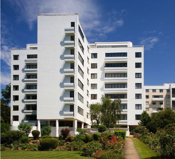
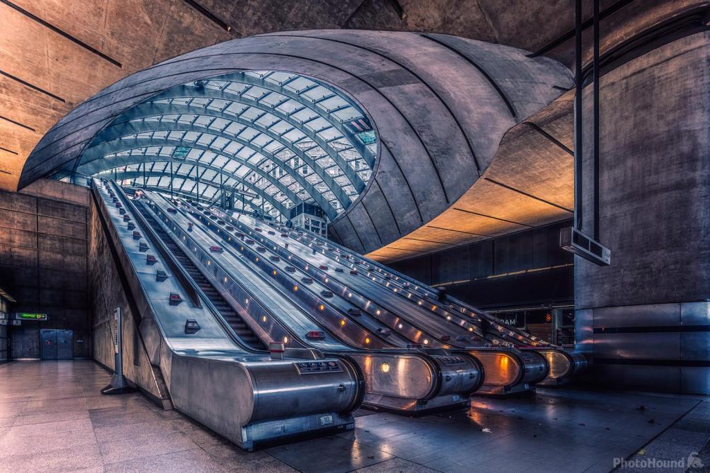
A History of British Architecture: Edwardian and Modern Britain c. 1900 to 1970
A meander through the History of British Architecture: Edwardian and Modern Britain c. 1900 to 1970
-
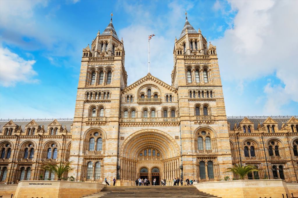
A History of British Architecture: Victorian Britain c. 1830 to 1901
A meander through the history of British Architecture: Victorian Britain c, 1830 to 1901
-

The Stuff of Dreams and Exploitation: The Case Study – Venice
Empire, trade, beauty, corruption, the sublime, the long death, and the circle closing
-
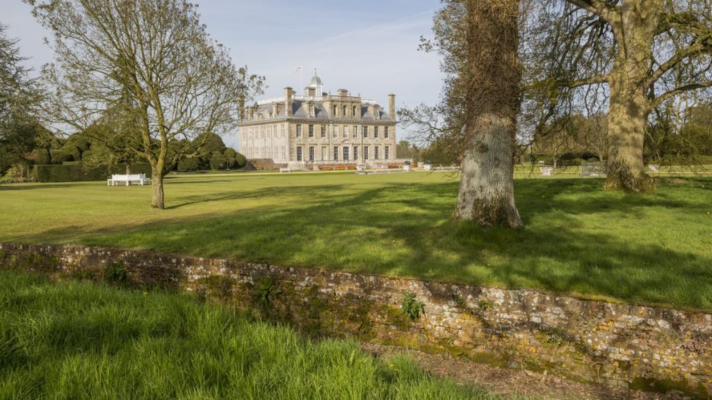
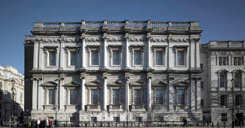
A History of British Architecture: Wren, the City, and the Long Georgian Century c. 1660 to 1830
A meander through the history of British Architecture by era. Wren, the City, and the Long Georgian Century c. 1660 to 1800
-
A History of British Architecture: Tudor and Early Stuart 1540 to 1660
A meander through the history of British Architecture: Tudor and Early Stuart 1540 to 1660
-
A History of British Architecture: Dissolution, Civil War, Empire and the Making of British Exceptionalism
A meander through the history of British Architecture. Some thoughts on what informs the ideological framework which explains all the subsequent architectural development.
-
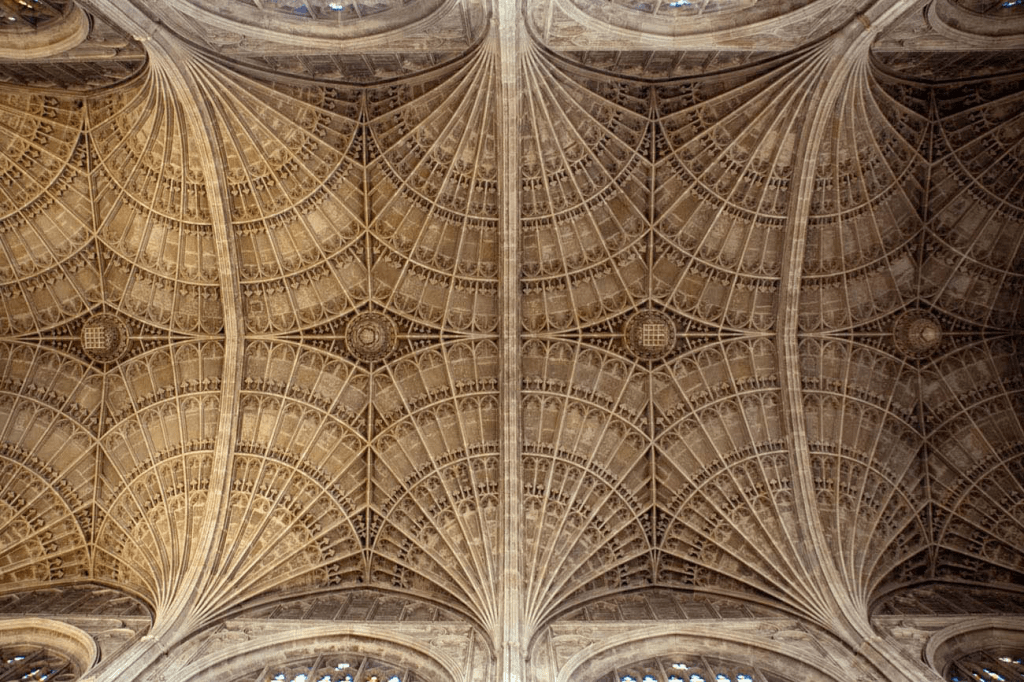
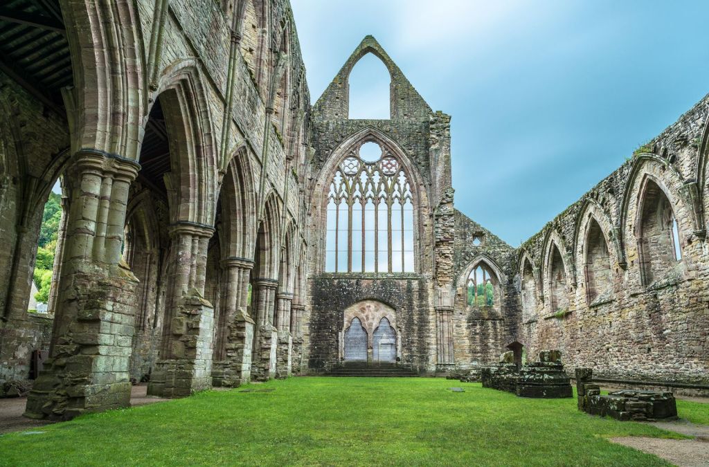
A History of British Architecture: Gothic Britain c. 1150 to 1540
A meander through the history of British Architecture by era. Part 5 The Gothic.
-
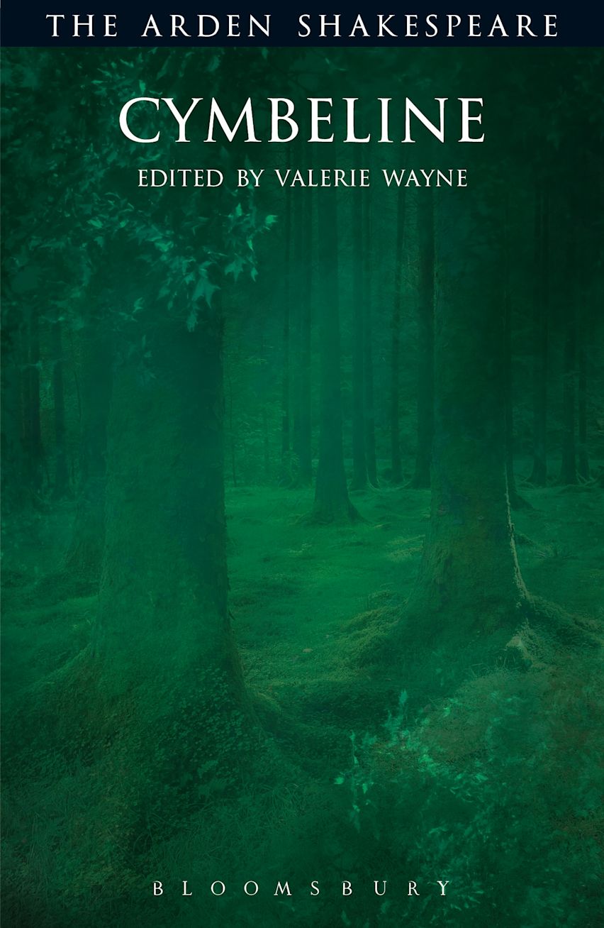
Cymbeline: Shakespeare and the Search for National Identity
A diversion in which we examine Shakespeare’s Cymbeline and its commentary on the conception of British nationhood.
-

The Norman Paradox, Continued: Sicily and the Problem of Italian Nationhood
A short diversion into the (non)-impact of Norman Sicily on Italian nationhood.
-
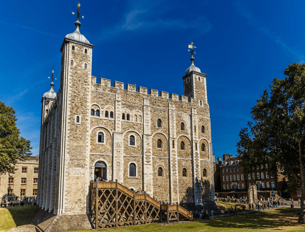
A History of British Architecture: Norman Britain 1066 to 1150 AD
A meander through the history of British Architecture by era. Part 4 The Normans.
-
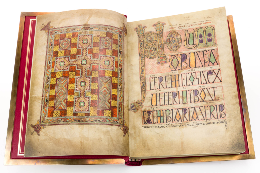
A History of British Architecture: Anglo-Saxon and Early Christian Britain c. 410 to 1066 AD
A meander through the history of British Architecture by era. Part 3 The “No So” Dark Ages.
