Impressionists in London at Tate Britain review ***

impressionism-at-tate-britain-review-october-2017

The EY Exhibition: Impressionists in London: French Artists in Exile 1870-1914

Tate Modern, 30th November 2017

Would I pay £17.70, the full adult price to see this. Hmm. Maybe. Different story if you are a member, (as you should be if you can afford it), but, if not, I’d say you would be much better spending your corn on the Rachel Whiteread retrospective upstairs. Given the fact that it was pretty busy on the Thursday afternoon when I waltzed in, I think I can safely say that the verdict of the public is less circumspect than mine (unless they were all members of course).

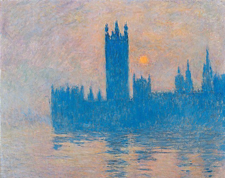
The big draw are the paintings of the Thames by Monet in the penultimate room which come from 1899 to 1901 when he took up residence each winter in the Savoy. In total Monet painted over a hundred views in the series, 37 of which appeared in a famous exhibition in 1904 in Paris. Drawn from various collections and with his famous view of the Houses of Parliament predominating, you don’t need me to tell you how marvellous they are. Any Monet series seen together is a thing of wonder, and these in particular are dear to my heart since I know the vantage point a few floors up in St Thomas’s rather better than I would like to. Is that enough though?

Well it all kicks off pretty well. The curators begin with a fascinating insight into the artistic response to the “terrible year” of 1871 which saw Paris devastated following the loss to Prussia in the war, the fall of the Second Empire, the three month siege and the brutal suppression by the French army of the Paris Commune. There is a Corot painting of Paris on fire with an Angel of Death departing high overhead and some powerful, and familiar, Manet drawings. The rest of the art here certainly shows what the artists who crossed the channel were escaping from. This was a time when the Brits welcomed foreigners with open arms. (catch a boat down the river and see a fine play, Young Marx, about another person who pitched up here and then enriched world culture). In fact London has been pretty much doing that throughout its existence so I doubt a bunch of ignorant pensioners in the shires will stop it.

Anyway a network was created when dealer Paul Durand-Ruel set up shop, and he embraced the young Monet, who spent a year here, (before his return at the end of the century), on the advice of Charles-Francois Daubigny (who isn’t a bad artist as it happens). Mind you I am not sure Mrs Monet enjoyed London judging by the face on display in her portrait. The slightly older Camille Pissarro popped up in Sarf London and Alfred Sisley joined the crew in Kensington, (proving that the French have always opted for the smartest bits of London). As we all know Pissarro and Sisley could paint, so Room 2 is a delight, though most of the works are familiar from permanent London collections. Anyway so far so good.

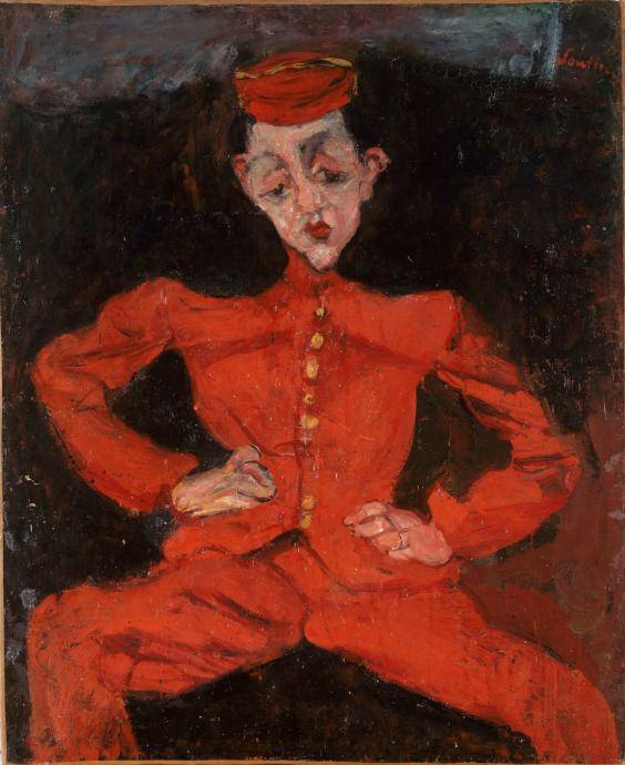
And then we get “James” Tissot. Now he may have been taking the p*ss out of genteel High Victorian Britain but, even if he was, it doesn’t make the paintings any more interesting. Stagey, bright and long on frocks I just can’t get on with them and there are an awful lot of them. Even so they make sense in the context of the story that its being told, so they certainly add to the exhibition, and, mockery or homage, they say a lot about the upper class Brits when they ruled the world. His friendship with the editor of Vanity Fair, Thomas Gibson Bowles provided the introduction to Society, (Tissot produced caricatures for the magazine), and Tissot ended up shacked up with his lover in St John’s Wood, which seems a posh thing to do.

What follows, rooms devoted to Alphonse Legros, who mixed with that rum pre-Raphaelite posse, Jules Dalou, Edouard Lanteri and worst of all Jean-Baptiste Carpeaux, is just not my cup of tea at all. These fellows were French emigres for sure, and part of the London artistic community, and very highly regarded by all accounts, but their painting and sculpture just looks like sentimental Victorian, faux-classical kitsch to me. It pads out the exhibition for sure, and there were plenty of punters who seemed to be lapping it up, and ignoring my admittedly inaudible snorts of derision. I admit I am an almighty cultural snob but it just didn’t seem to me that these chaps fitted the Impressionist billing, at least as I understand it.

We then had a mixed return to form centred on the Impressionists take on peculiar British sports and the outdoor places where they played them and took the air. Cricket and rowing understandably fascinated our Gallic chums. Again though it is Sisley and especially Pissarro who do the business with Tissot lagging behind. Especially admirable was Pissarro’s stout refusal to paint any part of Hampton Court Palace when he lived round the corner, even as he documented all the spaces around it. Given its majesty this took a pigheaded commitment to the “everyday life” tenets of Impressionism.

My eye in this room though was drawn to the best picture in the exhibition, Monet’s Leicester Square at Midnight from 1903, normally housed at the Musee Granet in Aix-en-Provence. Hello. If some-one told you this was painted decades later you would have believed them. I know the weather in London is, and was sh*te, compared to the South of France, but there was no need for Monet to depict this quite so graphically. Like the first and second generation Camden Town painters this is murk, night, light, rain and fog but also pure, beautiful and very colourful paint. More Expressionist than Impressionist?

This leads into a room full of fine paintings, of fog, the Thames and Westminster, as a starter before the Monet entree, with works from our friend Pissarro and three of Whistler’s nocturnes. The latter are undeniably atmospheric, with a definite thematic and stylistic link to his French contemporaries, but again you can see these any day of the week upstairs. After the Monet room, the curators have somewhat bizarrely tacked on some of Derain’s Fauvist views of London, specifically Charing Cross Bridge. I have never been entirely convinced by his paintings but they are arresting, he was French, he was inspired by Monet. Yet obviously they are not Impressionistic, nor was he in exile.

So there it is. Influences, precedents and antecedents of course matter in an overview of this sort. The sub-title of the exhibition indicates that it covers French artists in exile from 1870 to 1914. Which is exactly what it is. There is a clear, if somewhat cliched, insight into Victorian London. And there are some truly stunning paintings. But there is also some frightful, in my opinion, padding, and this detracts from the whole. If you like Monet though …..

Age of Terror exhibition at the IWM review ***

aot_website_645x426_v3

Age of Terror: Art since 9/11

Imperial War Museum London, 24th November 2017

The IWM has a splendid collection of war art which is always worth seeing and reflecting on when it is exhibited. Here the curating team has assembled 50 or so works from 40 or so artists to reveal how they have responded to war. conflict, terrorism and security since the events of 9/11. So a first for the IWM I think in terms of contemporary work on this scale.

To quote the curators. The exhibition explores four key themes: artists’ direct or immediate responses to the events of 9/11, issues of state surveillance and security, our complex relationship with firearms, bombs and drones and the destruction caused by conflict on landscape, architecture and people. By and large they succeed though the plethora of artists, approaches, media, messages and effect makes it a bit jumbled. It is concise enough though, some very fine contemporary artists are displayed and there are a handful of works that really make you think. Mind you there are also a few that don’t stand up to much scrutiny.

The exhibition begins with a video from Tony Oursler who lived in Manhattan and recorded the day’s events in an immediate and spontaneous way, You may well have seen some of the footage before: that doesn’t make it any less raw or affecting. Hans Peter Feldmann’s 9/12 Front Page, which collated front pages from major newspapers around the world the day after, has a similar effect. And Ivan Navarro’s The Twin Towers which follows is another striking work, a light installation which creates the illusion you are at the top of the towers looking down through them. The next couple of rooms have some interesting works, for example Gerhard Richter’s September from 2005 which depicts the tail-fin of a speeding jet, but here it is a print not the original oil, and one of the rugs created by Afghan craftsman, which also appear later on. But there are some failures as well, Grayson Perry’s pot, Dolls at Dungeness, and the Chapman Brothers Nein! Eleven!, which is pretty facile.

Ai Weiwei’s Surveillance Camera with Plinth, works as do his other marble renditions of everyday objects, and makes its point, but doesn’t really get more interesting on repeated viewing. Jitish Kallat’s Circadian Rhyme, showing the gamut of everyday situations where we are now searched, makes a similar point through the use of model figures. Further on I was most struck by Rachel Howard’s iconic image Study, Mona Hatoum’s Natura morte, delicate, shiny Venetian glass versions of grenades, by Francis Alys’s video, Sometimes Doing Is Undoing and Sometimes Undoing Is Doingcontrasting the maintenance of automatic weapons by both sides in Afghanistan, Head of State by kennardphillips and, especially by Omer Fast’s 30 minute film, 5000 Feet is the Best, with its repetitions, genre swapping and blurring of fact and fiction. The nature of warfare in the age of the drone is also considered by James Bridle Drone Shadow, an outline created on the lower floor of the IWM. 

As I say there are other works, usually video, that didn’t really leave any impression on me I am afraid, and maybe diluted the overall impact of the exhibition. The direct responses to the events of 9/11 and the works which explore the nature of modern warfare were most effective. Worth seeing I think, it’s on until 28th May 2018, and worth taking the time, with the best of the art here, to think about the impact of 9/11 and the way the “war on terror” has changed our world and the nature of conflict.


Natural Selection exhibition at the Former Newington Library review *****

image

Andy Holden and Peter Holden: Natural Selection

Artangel at the Former Newington Library, 24th November 2017

This might just be the best exhibition I have seen this year. The Former Newington Library was new to me I confess, and reeks of institutional instruction, which matched the tone of this “installation” to a tee. Apparently it used to contained the natural history collection of a father and son, Richard and Henry Cumming. Well done to Artangel for sniffing out the space and to video artist/cartoonist/animator Andy Holden, (who i See has his own band, the Grubby Mitts), and his ornithologist Dad, Peter, for creating this marvel.

It all apparently started when Andy, who could have stepped straight out of a 1970s Open University TV programme, saw a blackbird building a nest in Dad’s garden. Cravatted Peter Holden, who could in turn have stepped straight off Blue Peter, (in fact he was did), is an avian guru and, when Andy returned home after art school, their shared passion was rekindled. This then, even before we get to the bird and other stuff, is a poignant study of a father and son relationship. (It even begins with Andy in the pram wrestling with a book on birds).

After a series of joint lectures Andy started to gather material for the first part of the exhibition on bird’s nests. Upstairs there are some marvellous examples of nests contained in a vitrine in an “old style” museum format, another collection of feathers, a smattering of bark, a giant recreation of a bowerbird’s bower and some other bits and pieces. Not all is what is seems: this turned wooden objects are created from sonograms of bird song and some of the nests were created by Andy and mixed in with the real thing. Art and nature start to intertwine.

A quick perusal and then you sit down for the video with father and son taking it in turns to explain and illuminate, whilst a central screen shows footage from their own field trips, as well as various documentaries and the like. They look like old style nature documentaries but as father and son range through types of nests, nest sites and nest materials, some fascinating themes emerge. Peter Holden focusses on the “scientific” explanations of nesting behaviour, Andy gets you thinking about the bird as creator, even “artist”. The “practical” and the “beautiful” are explored.

How do those birds who build these elaborate structures “know” what to do? Do they have a picture in their “minds” of what they want the nest to look like? Why does the bowerbird go to so much effort in creating his bower, and the extraordinary display of themed objects he gathers? How does this relate to the Holdens’ own collections? Can it really just be a process of “sexual selection”? How do partners, families and communities collaborate (various bird species of course but also here father and son)?

Downstairs we first encounter a rook character in a cartoon strip that Andy created which has his father Peter as a “Mr Holden” charged with keeping the rook in line. The father/son relationship mined further. 

We also have another “collection”, How the Artist was Lead to a Study of Nature, which recreates the hoard of 7,130 eggs police discovered at a “collector’s house in 2006. These eggs are laid out on the floor in cardboard and plastic boxes, as they were on discovery, which also emphasises their fragility and increases the level of temptation for us the audience as these are undeniably beautiful objects. As a kid I was fascinated by birds, and the opportunities the world of ornithology gave to a boy who craved the pleasure of classification. Observing, ordering, listing, collecting. This never extended to eggs, that was already forbidden, but I could see the attraction. This, fortunately, never developed into a full blown, twitching habit, I have seen the impact this can have first hand, but I understand the obsession.

Next door is a video installation, The Opposite of Time, narrated this time by Andy Holden alone, in the form of an animated crow who first appeared in Peter’s RSPB magazine contributions. The crow passes through real habitats, notably when charting the battle between egg “collectors’ and the RSPB and volunteers over the first ospreys to return to Scotland in the 1960s. However the crow, who ages, also flies across multiple paintings, representing the best of the British landscape artistic tradition (Constable, Turner, Nash, Ravilious, Hockney). There is a further screen showing photos and some film which documents the history of egg collecting in the UK, from aristocratic pursuit by “gentlemen of science”, through to the 1954 Act which criminalised it and finally on to the “working-class” undercover activity of more recent decades.

This becomes an insightful analysis of the psychology of collecting, and how the public and scientific consensus on the morality of the “hobby” has changed through time. What makes the desire to possess so powerful that “collectors’ are prepared to destroy the very thing they purport to love? How can we enjoy such aesthetically exquisite objects, knowing their history? What gives humans the right to collect from nature? Why were toffs feted for their “scientific advances”, whilst the dispossessed collectors of today are banged up?

There are multiple parallels through the exhibition with “human” artists. The materials used by sculptors (Andy Goldsworthy), the landscape artists (Richard Long’s mud), the forms we encounter (Barbara Hepworth eggs), the collections and classifications of conceptualists (Susan Hiller), the ready mades and found objects tradition (from Duchamp on), the Pollock like lines on many of the eggs, the watercolour like pastels. Play your own game with this.

So there you have it. A natural history programme. An introduction to aesthetics. A history of landscape art. A lecture on class. Science and art. Father and son. Nature and nurture. Passion and obsession. Nerdiness. Eccentricity. Nostalgia. Some very pretty things. All in a couple of ramshackle rooms in SE17. The exhibition was extended but I think is now over. I do hope it gets another outing. I really, really need to see it again. 


Monochrome: Painting in Black and White exhibition at the National Gallery review ****

telemmglpict000143874513_trans_nvbqzqnjv4bqbxmmpledrwark03csdncgt09r0lytmfjbj_zur1l3m0

Monochrome: Painting in Black and White

National Gallery, 22nd November 2017

For as long as there has been Western art there has been black and white painting. Used in preparation for works in colour, to heighten the impact of light on a subject, to “imitate” other art forms such as sculpture and photography, or simply for its own aesthetic power, it seems like many of the big names in the canon have given monochrome painting, or something close to it, a whirl.

That’s pretty much all I learnt from this exhibition. No matter. There are more than enough wonderful paintings on display to paper over the fact that the thin premise is stretched beyond breaking point. And I don’t care about the “omissions” that the criterati always start bouncing up and down about whenever these thematic overviews are constructed. Of course I would be bloody ecstatic if Guernica was included, or a bunch of Goya’s “black paintings” had filled a room here, (mind you they have way more colour in them than you might think), but I think I get why they are not there. I also get why there are no drawings, the clue is in the exhibition title. Though they have smuggled in van Eyck’s sketch of St Barbara – fair dos though its van Eyck. Oh, and a piece of stained glass. And a manuscript. Hmm this pedantry thing is contagious.  Let’s just work with what we have instead of having a pop at the curators for stuff that plainly they had no chance of borrowing.

So what stood out for me. Well the Hans Memling altarpiece, the Donne Triptych from 1478, is a stunner. Shown partially closed so that we can see through to the intense colours of the Virgin and Child with Saints and Donors, with the saints Christopher and Anthony painted in grisaille on the outside panels looking like stone statues. Memling’s figures always look a bit “softer” to me than say van Eyck from a few decades prior, and the compositions more straightforward. I was also taken with the charming Nativity from another Netherlandish master, Petrus Christus (from around 1450) which was ostensibly included to show off the way grisaille was originally used in the margins of devotional paintings, here to create a frame from an architectural arch with some Old Testament action portrayed

in the same room I was also drawn to a couple of drapery studies from two of the finest Renaissance draughtsmen, Ghirlandaio (this from about 1472) and Albrecht Durer, a spooky women seen from behind from 1521. I know these are just bits of cloth but I can get very excited about cloth in Renaissance pictures and the monochrome heightens the contrast between light and shade.

In the next room most people seemed drawn to Ingres’s Odalisque in Grisaille, a monochrome version of his colour painting of the same nude lady subject. Her skin does have a strange waxy quality here but I am always a little uncomfortable in the presence of nudes (pictorially I mean, in real life I would be mortified). There are plenty of other stunners on show in this room led by the Jan van Eyck St Barbara from 1437, executed in silverpoint and touched up with ink and some oil in the background. Apparently the first deliberate monochrome work in Western art, it is not clear if this was what he intended, but it is amazing to see the detail of its creation close up.

Opposite this is a Maternity from the end of the C19 by Eugene Carriere, a Symbolist, which is striking for its ghostly representation of a serene, but somehow pained, mother and daughter, which echoes a classic Madonna and child. Next door to this is Picasso’s Infanta Margarita Maria from 1957, the little weeble princess from Las Meninas, here rendered in partially cubist fashion. Apparently he rendered all the characters from Velazquez’s meta masterpiece in all manner of ways, but this shows why PP is the man when it comes to monochrome and captures the essence of the brattish Infanta. I don’t know if she was a brat but she always looks pretty Veruca Salt, high maintenance to me.

As if that wasn’t enough there is also one of those scratchy, black and white oils from Giacometti, here of wife Annette from 1957, where he seems to obsessively paw at the paint to capture the spirit of the sitter. Colour never really played a part in Giacometti’s work so no surprise he is here.

The next room has a whole bunch of paintings intended to mimic sculpture including a Titian and a Tiepolo for those inclined to that sort of thing (I am not). The Mantegna is worth a good peek, with all its different stone colours, and dramatic movement, but it is quite busy. No surprise then that I was drawn to the Jan van Eyck Annunciation diptych from 1433-35. These amazing grisaille figures, unlike the Memling, were inside the diptych panels and were meant to emulate the small devotional panels made in prior periods from ivory. You could touch them. I mean don’t touch them. That will get you into a lot of trouble but they are perfect. The bottom of the plinths sit on the wooden frames, the niches recede into inky blackness, the drapes are incredible, the fingers so elegant yet the lady grasps her bible quite firmly, they both seem to have the best curling tongs ever made for hair, the shadow cast by the angels wings is properly fuzzy and the gravity defying stone dove makes me snigger every time. I say every time. I mean the one time I stood in front of this for an inordinately long time in the Thyssen-Bornemisza where it is housed along with some other Northern Renaissance gems. The Prado done the road has more than its fair share of Netherlandish wonders, best of all van der Weyden’s Descent from the Cross, worth getting on a plane to Madrid all by itself, but the T-B, gets close if you like this sort of thing. And the T-B is great if you want a whizz through Western art, with its half an Ark approach (one of everything).

Next door to this van Eyck is the equally extraordinary Head of A Woman (1520) from that egotist Durer again. It is a drawing, but what a drawing. Hair parted in the middle, eyes closed but not in devotion, head tilted back, round face, sort of chin dimple, light on the forehead, this is a very particular pose and a very particular model. Shiny, like metal. No sign at all of his preparation. He real was a clever fellow.

In the next room the curators have, unsurprisingly, snuck in a Rembrandt from the NG vaults, Ecce Homo, which is the height of drama. The oil from 1770 by Etienne Moulinneuf takes a famous painting by Chardin, La Pourvoiese, which was turned into a best selling print, and then creates the illusion of broken glass on top. It has to be seen to be believed, is a fine addition to the long line of deconstructed art works and the curators are pleased as punch with the inclusion, but the joke wears off pretty quickly. Nothing else to detain me in that room, you may feel differently, that is your prerogative, so on to the next room, where the influence of the camera is writ large.

I got on very well with Norwegian Peder Balke’s landscapes and seascapes. They are the height of romanticism and a teeny weeny bit melodramatic but they stir the soul, no doubt about that. Who doesn’t like wind and waves, and his tiny little Tempest from 1862, looks like it was painted “plein air”, in fact with plenty of air. I imagine the salt in the old fella’s beard and the wind knocking over his easel.

The Image as Burden (1993) from Marlene Dumas, who is new to me, is very striking as is Vija Celmins Night Sky no 3 (1991) inspired by Jasper Johns. Yet the eye is drawn in this room to Chuck Close’s gigantic portrait of American sculptor Joel Shapiro. Close was no mean photographer and his early oils used cropped portraits as the source for hyper realist, monochrome likenesses that show every wrinkle and blemish on the skin and every detail of the sitter’s features. This one however dates from 1993. By now Close was paralysed and had to attach the brush to his arm. He therefore uses a myriad of ovals within squares in different tones to build up the portrait. From afar it is like a pixellated but still very graphic and exact likeness. Close up it dissolves into near abstraction

We are then treated to the master of the “photo as painting” in Gerhard Richter. with his Helga Matura with her Fiance, which amazingly was painted in 1966. Here Richter takes his trademark photo, this time from Quick magazine, as the source. Ms Matura was a prostitute who was brutally murdered, and was the subject of salacious press attention. Richter’s blurring technique and the grey palette, “the ideal colour for indifference”, is intended to create an emotional distance from the subjects and the event. It works. I still curse the fact that  missed the Richter retrospective at the Tate Modern in 2011.

On to the final, (well not quite final), room. Monochromatism, in its purest black and white form, has an obvious attraction for artists drawn to abstraction so there was much to choose from here. Pride of place, predictably, goes to a Malevich Black Square (1929) which, i didn’t know until now, was originally hung high up in a corner to echo Russian icon paintings. Swivelling round you take in a Black and White Bar I from Elsworth Kelly rendered in entirely flat paint, an Op Art classic Horizontal Vibration (1961) from, guess who, Bridget Riley, one of those ropey “closed door” grey tortoiseshell numbers from Jasper Johns, one of Josef Albers’ Homage to the Square, 1965, a slightly dull Frank Stella, Tomlinson School Park I, 1959, one of Cy Twombly squiggly diptych from 1970, which, annoyingly, I was somewhat taken with, and a beautiful sheet of painted grey glass from our friend Gerhard Richter called Grey Mirror (1992, where does he think these titles up from).

Like I say this room is about as minimally abstracted as it gets. Mind you the final room has nothing in it. Except you bathed in yellow sodium light, so that you gradually turn grey as all the colour drains away. This is the court jester Olafur Eliasson playing tricks with you in his Room for One Colour from 1997. He was the chap he put that great big misty sun in the Tate and I saw another installation based on rippling water in Belgium somewhere that blew me away. The man is a marvel, (well the man, his studio and all his collaborators), who twists the basic elements, air, water, light, temperature, fire (well maybe not fire, yet), and then messes about with them using a hefty dose of technology to upset with the perception buttons in our heads. Sometimes daft, usually playful, and always, from the sound of them, beautiful, his large scale installations probably take ages to create and cost a bomb, but create delight. We need more delight.

So a thoroughly enjoyable exhibition even if its purpose is a bit tenuous. Perhaps best of all was the fact that the exhibition was not crowded so you can breathe and, most importantly, look. Some of the NG “Old Master” blockbusters in the bowels of the Sainsbury wing are so preposterously stuffed with punters at all times of the day and evening that, frankly, there is little point going. Not so here. You get to see a who’s who of Western art giants, with their technique exposed.

Basquiat exhibition at the Barbican review **

3442

Basquiat: Boom For Real

Barbican Art Gallery

I just don’t get it. Why are punters and critics raving about this broad retrospective of the artistic myth that was/is Jean-Michel Basquiat? I completely understand how significant an artistic/cultural phenomenon he was before his early death in 1988 (aged 27, same age as Masaccio, and various rock’n’roll heroes), and he definitely comes across as an interesting bloke, living in interesting times, mixing with interesting people in an interesting city. But “one of the most significant painters of the 20th century” as the intro to the exhibition claims. Come on. Picasso, Juan Gris, Malevich, Chagall, David Bomberg, Stanley Spencer, Emil Nolde, Egon Schiele, George Grosz, Oscar Kokoschka, Max Beckmann, Otto Dix, Gwen John, Lucien Freud Agnes Martin, Graham Sutherland, Francis Bacon, Bridget Riley, Robert Rauschenberg, Jasper Johns, Rothko, Clyfford Still, Josef Albers, Barnett Newman, Frank Stella, Anselm Kiefer, Richard Hamilton, Alex Katz, Peter Doig, Richard Serra, Gerhard Richter. That’s just some of the painters I think are better, Even Hockney, for all his faults, is a way better artist in my book than Basquiat. 

Maybe his reputation simply reflects the price of his art. If a Japanese collector wants to pay $110m for one of Basquiat’s works who am I to argue. The same fella paid $57m for another one last year. I guess he must like them. Mind you some numpty just paid $450m for a Leonardo that probably isn’t. I hope whoever it is hands out the readies to charities on a regular basis and pays his or her, or maybe its, taxes.

For me this does point up a whole bunch of necessary, (and probably unpleasant), fictions on which our world is hooked. The fiction of money. The buyer presses a key to conjure up some electronic corn, the seller parks it somewhere in a different server, They both believe it is real. The notion of value. The value of a piece of art is a function of who paid for it in the first place, and for what purpose, whether it survived, so how scarce it is, and how it is now viewed by experts (whose opinions change, a lot). We, the viewing public, also now get a look in, if we like what we see. Let us call this the aesthetic value. This may not be synonymous with its use value. Its exchange value, given its unique character, is likely to be its price, and this can be anything that a buyer wants it to be. A unique object, a tiny coterie of buyers, a rigged market. Clearly price is no indication of value. We also have the fiction of legal ownership sitting behind this Leonardo transaction. The seller’s fortune was built on potash. Once a state asset, now his. Right time, right place, right attitude. And finally we have the prosiac fiction that Salvator Mundi may not actually have been painted by the hand of the great Renaissance polymath. Does it matter? No idea.

Anyway Boom for Real kicks off with some early works from the New York/New Wave exhibition in 1981. There are some naive townscapes which stand out and some of the trademark self portrait skulls. We then see J-MB’s gnomic graffiti work as SAMO© and tour through late 1970’s and 1980s New York, meeting some of his chums and collaborators along the way. Music (he was in a band), video, performance, clubs, postcards, photos, flyers, poetry, helmets, other stuff. Not much visible in the way of drugs, best keep that under wraps (no pun intended), though his habit exudes out of the later works. There is no doubt that J-MB got about a bit and that the New York scene of this period was pretty exciting. No wave, new wave, Mudd Club, Club 57. Most of the music that came out of this era is shite, trust me, but it did give us the mighty Talking Heads, and, latterly, Swans, and the first stirrings of hip hop. Of course this was all middle class, white art students feeding off the prior generations of New York cool, but, given the quality of the legacy, this was heady stuff. (We Brits had to make do with proper working class, DIY, Punk and its antecedents – I for one was happy with that deal).

J-MB stood out because of his beauty, his personality, his relentless self-promotion, his nihilism, his “self taught”, status and obviously his colour. No wonder he was embraced and feted by the artistic establishment, (there is a canvas by Keith Haring, J-MB’s most obvious “influence”), including a room devoted to the relationship with the granddaddy of them all, Andy Warhol. As well as some double portraits, the curators are proud to show off a lease for the flat AW rented to J-MB. There is a lot of stuff like this upstairs, whisper it, maybe a bit too much.

Downstairs we finally get to see more substantial work and this, I am afraid, is where I have a beef. Lists of stuff J-MB read, references to canonic Renaissance artists and Jazz greats, anatomical life sketches, self portraits, poetry of a sort, black heroes, cars, planes, repeated signs and symbols. I can appreciate the fidgety energy and the restless enquiry which blares out from these works and their semiotic value. I can see that J-MB had a lot to say about the situation of a black man in a white world. I can definitely see why people were attracted to him. What I can’t see is any interesting drawing or painting marks. There is a lot to read here, and the man undoubtedly had a lot to say, but nothing much to really see. The hyperbolic nonsense from the curators which follows you round the exhibition didn’t help.

I know I am in a minority here and, given that this is the first major exhibition of his work to appear in the UK, (and there is next to nothing in collections), I can see why the punters are rolling in. I just don’t think he was a particularly interesting painter. Person yes, painter no. There was more for me in the few pieces of work from David Hammons in the recent Tate Modern Soul of a Nation exhibition than there is across all of this exhibition. (Soul of a Nation exhibition at Tate Modern ****). And he, Hammons, is a fella who can properly take the conceptual piss. Witness USD 200K some-one paid for his work On Loan.


Opera: Passion, Power and Politics exhibition at the V&A review ****

320

Opera: Passion, Power and Politics

V&A, 13th November 2017

You can’t seem to navigate on t’Internet, (all right, the bit that isn’t hate, porn or celebrity, which doesn’t leave much), for confessionals from opera lovers telling you how they came to love the “queen”, or is it “king”, of art forms. Alongside this are guides on where to start and how to enjoy your first opera. All this tends to come with an undercurrent of pleading though. The rare opera reviews here from the Tourist always seem to start with a diatribe about how bad opera can sometime be. I have tried with limited success to convert the SO, MS, BD to the cause though BUD, given his admirable lust for life, has responded magnificently. 

The fact is that opera can be hard work and that all of us inside the tent, by trying to appear welcoming and non-patronising, often come across as the exact opposite. Like evangelical Christians. The other problem is, despite what some of us want to believe (“it’s for everyone”, “you can pitch up in shorts”, “there’s tons of tunes”), there is always a proportion of the audience, especially at the ROH, who are there because they, (or someone else on their behalf), can afford it and not because they love it. And whisper it, some of it is unadulterated shite with preposterous plots, silly costumes, designers and directors craving kudos over interpretational vision, under-rehearsed divas who can sing for sure but can’t act and don’t care what happens beyond their arias. Yet when it works the “state of grace” you enter cannot be matched, even in my beloved “straight” theatre or from music alone.

It’s an utter mystery to me how this works for those who get off on Wagner (I’d rather have an enema), Verdi or Puccini but, as Aretha would have it, Doctor Feelgood has pitched up for me during Britten, Mozart and Monteverdi to name but a few.

So how were the curatorial boffins going to make this work. A minority art form, which may have a visual component but is primarily aural, which spans hundreds of years. Surprisingly well as it turns out. Through the simple device of picking a few specific works, premiered (though not the Wagner) in specific European cities in specific years, usually periods of immense social, political and economic change. And by not going in too deep. And with the use of those natty headphones which have worked so well since the ground-breaking David Bowie Is exhibition.

Now there are proper reviews bleating about what is “missing” in terms of composers and/or locations. Or saying the “wrong” works have been chosen. Or saying there isn’t enough musical content. Doh, it’s an exhibition not a performance and all this carping comes across “as I know better” elitism, the very thing this exhibition should eschew. For my money, given the obvious limitations. the team has done a terrific job in pulling together all manner of material and relating it to the contexts they have chosen to highlight.

You will get a sense of how the chosen operas reflect the societies from whence they came, the themes that each engaged with and the process of their creation and performance. All spiced up with lots to stimulate eye and brain. I accept that the soundtrack, with excerpts from the seven chosen operas, is a bit limiting but I didn’t care. I got to see lots of lovely objects, maps, paintings, scores, costumes, props, posters, programmes, models and instruments. I got some well chosen video footage of performance. I got a recreation of a set for Handel’s Rinaldo in booming London and of Shostakovich in his study banging away on his piano. I got all sorts of spurious feminist interpretations of Strauss’s still horribly ropey Salome in Dresden backed up with some dirty pictures from Kirchner. I got a sense of just how much ducking and diving Dmitry had to do to create his two premieres of Lady Macbeth of the Mtensk District in Leningrad. I saw why the Italians are proud of the boy Giuseppe V, here with the big chorused Nabucco in Milan. I could hear how Monteverdi changed the Western musical world, albeit all for the decadent few of La Serenissima. I could see and hear how the Enlightened Mozart and Da Ponte stuck two figures up to the Viennese elite. The exhibition even has a swing at equating Wagner’s dodgy Medieval comic book warriors with the genius rebellion of Manet. Yeah, right.

Now I admit sometimes the urge to capture the big picture, and the need to make exhibits relevant, leads to some overly imaginative treatments from the curators. I would also have liked a bit more hard information on the handful of post 1945 productions we were treated to at the end. The footage was all well and good, (and the selection suited me), but might have left the uninitiated a bit bemused. Which is a shame because, for my money, the stories, plots, acting, productions and ideas which contemporary operas encapsulate are far easier to stomach than some of the “classics”, and the music no more challenging than the soundtracks to many big budget cinema releases.

Still mustn’t grumble. This is another blinder from the V&A and the new gallery is nice and airy (I know it’s underground). It isn’t going to pack ’em in Pink Floyd style and I have to say that my attendance, admittedly on a weekday afternoon, only served to reduce the mean average age. If you have some interest in opera, and are not too snobby, you will definitely be rewarded. Perhaps more importantly I would say that, if you have any interest in European social, economic and cultural history, even if opera isn’t your bag, over the last 500 years, this is also for you. Which frankly should include everyone who goes through the doors of the V&A.

Right there’s my puff. Now can I have my Punk and Post Punk 1977 to 1985 exhibition please Mr V&A.


Jasper Johns at the Royal Academy review ***

3220

Jasper Johns “Something Resembling Truth”

Royal Academy of Arts. 10th November 2017

So here’s my theory. Sometime in the mid 1970s the real Jasper Johns was kidnapped by aliens and replaced with a cloned doppelganger. All the AI software was packed in but they forgot to prevent him from clicking “remind me later” when the updates rolled in. Which means that somewhere out there some little green fellas with one eye and a pokey-out antenna in a parallel Piccadilly are right now swooning over some sexy encaustic rendition of a far away galaxy. Whilst we look at bits of string dangling over some grubby canvasses or some vague tracings from a man too preoccupied with his own mortality.

How else to explain the chasm between the powerful and seductive work of the 1950s and 1960s and the relatively mundane offerings of the last few decades? This large scale retrospective kicks off with an introductory room with an iconic 1967 Flag, a trademark 1961 Target, and one of the grey cross hatched paintings from the 1980s where the doors have closed. Which seems prophetic. The curators have chosen to follow a broadly chronological format but have snuck in some of the later works to emphasise the links between the different periods of Mr Johns illustrious career. For me it just serves to highlight the fade in the power of the ideas and of the execution.

Mind you when it’s good it’s bloody marvellous. I can’t see how anyone could fail to be blown away by their first sight of Johns’ US flags from the mid 1950s. Conjured by a dream apparently, begun in oil but finished with strips of paper and that drippy, waxy encaustic paint, they have the material quality of their Abstract Expressionist predecessors but none of the boorish arrogance. Here is an everyday image, rendered realistically, but of a symbol charged with meaning. A sign of the signified. Having experienced this eureka moment there was no holding JJ back in his hunt to give us ““things that are seen and looked at, not examined”. Targets, the contents of his studio, hooks, coathangers, cutlery, beer cans. And the maps, those marvellous maps. I love maps, (I confess, without shame, to a geography degree), but these are something else. Of course I say maps, but bar one diversion, it is just one country and one typology. And then the numbers. One font, multiple variations, multiple materials. I wanted to go and lick the wall of bronzes. Don’t ask me why. Had to settle for staring.

All this symbolic stuff mixes the best of the pop, the conceptual, the minimalist and the Duchampian everyday with the beauty of the making. The fascination with language and meaning and the urge to deconstruct the painting itself led to some other jaw dropping stuff. Paintings prised apart by balls, the dissonance of primary colours and their linguistic identities, a canvas bitten by a bloke, presumably Johns. Bits of bodies. The bronzes perfect in their verisimilitude and the inspiration for subsequent generations. Love it.

Then he discovered that wretched cross-hatching and it all came off the boil. I can see the urge to portray repetition, literalness, the absence of meaning. But take away the mystery of the symbols and you risk banality. Trying to make us think there is something behind this doesn’t cut it for me. Same with the references to Munch, the collaboration with Samuel Beckett, the Catenary series, the revisit of his Seasons work which take up the second half of the exhibition. There is still much to chew on for sure and the imagination is fertile. They just don’t grab you by the throat like the earlier work.

In contrast to his mate Robert Rauschenberg, whose sense of fun and collaborative urges meant he could keep leaping from one bonkers project to the next, I reckon this dissection of the everyday might have been a bit of a trap for Jasper Johns which proved tricky to escape. Which is maybe why he has ended up quoting himself, always a bad sign. Still lucky for us he fell into it in the first place as we would be much poorer without it. As a reminder “art” is simply that which the rich and powerful buys, (with their own money or yours via pubic galleries), in this most perfect of capitalist markets. But, luckily for us plebs, the key externality is the opportunity to see some life enriching stuff. The first five or so rooms of “Something Resembling Truth” are about as good as it gets in terms of the second half of the C20 for such stuff.

Designs of the Year 2017 at the Design Museum review ****

beazley-designs-of-year-2017

Beazley Designs of the Year 2017

The Design Museum, 8th November 2017

If you have any interest in design you are probably on to this but, if not, you should be. This is the tenth year of the exhibition, now held in the basement of the Design Museum’s plush new Holland Park home. I have been in the previous three years and, as before, there is plenty to fascinate and wow the imagination of the layman.

The exhibition comprises 62 projects divided into six categories: architecture, digital, fashion, graphics, product and transport. These are contained within a grotto like structure made up of some sort of curious paper mache like material. Very playful. There’s even some Lego to keep the kids occupied; one of the products is some natty “sticky strips” that might allow your Lego creations to defy gravity. I divined a more interventionist vibe than in prior years with a very definite focus on recycled materials and on minimising ecological impact. Sexy brand stuff was thin on the ground. The designers on show plainly what to make good things happen. Hats off to them.

Now I have to confess that I find the architecture, product and transport categories more interesting than the digital, fashion and graphics categories but there is literally nothing here that doesn’t get the brain cells working in some way. The Smithsonian National Museum of African_American History and Culture in Washington, Zaha Hadid’s last building, at the Antwerp Port Authority (I’ve seen it – it’s bloody awesome) and the  controversial Benetton store in the Fondaco dei Tedeschi in Venice, stood out in the architecture section. My favourite though was the Croft Lodge Studio fashioned out of a derelict C18 cottage. I want one. In transport the standout surely was the Scewo mobility chair which can climb stairs. I also fell for the self-driving, electric tram system from China which is guided by a double-dashed strip on the street! As for products I was drawn to the search and rescue drone designed to help migrants in the Mediterranean, the Gita robot personal helper (though it could get very annoying) and, especially, the Sufferhead Original Stout beer concept, a powerful idea.

Anyhow I am sure you will find something to draw you in. Now it is a pretty small space, so this won’t take up too much of your time, maybe an hour or so. Which means, if you aren’t to feel a little bit miffed by the 13 quid admission, (get an Art Fund Card to halve the price – all you cultural flaneurs should invest in one), you need to leave time to cruise the permanent exhibits in the DM. Up on the top floor is a compact overview of design history, piled up with some absolute classic products, which should equally please the nostalgic old and digital young. There is little that will surprise but much that will delight.

Best of all is the beautiful interior of the DM space carved out of the old Commonwealth Institute which has rescued, and restored, its truly stunning, though very problematic, hyperbolic, paraboloid (!) copper roof. The original building, completed in 1962, designed by Robert Matthew Johnson-Marshall & Partners, is the finest modernist building in London IMHO, ahead of the Royal Festival Hall. After the CI itself was canned there was a real chance the building might be toast as well but fortunately pragmatism reigned, and architect John Pawson was finally wheeled in to oversee the salvation of the interior. Some whinged about the price to be paid to make this all happen, namely the development of luxury flats in the square in front of the new DM. Ignore them. These too are stunners, an understated design from Dutch wunderkind-architect Rem Koolhass’s OMA.

So pop on your smartest black designer togs and channel your inner Arne Jacobsen, Dieter Rams or Jonathan Ive.


Scythians exhibition at the British Museum ****

telemmglpict000137671553_trans_nvbqzqnjv4bqoqs0bxrj0vmcthymjmv0p4xicgr5rwvxeifgf8inawq

Scythians: Warriors of Ancient Siberia

British Museum, 2nd November 2017

I have been bowled over by most of the recent exhibitions I have seen at the British Museum, covering the history of Sicily, the art of South Africa, US modernist art printmaking, (The American Dream at the British Museum review ****), British Watercolour art (British Watercolour Landscapes at the British Museum review ****) and the culture of the Celts. I am also, as the preponderance of glowing “reviews” on this blog testifies, pretty easily pleased. I like to think I have discerning taste in what I choose to see and am open-minded. The reality is I am childishly indiscriminate. 

So based on past experience and the reviews I was looking forward to this exhibition. I dredged up what I knew about the Scythians from my early teens as a speccy, bookish, solitary swot who had a brief fascination with ancient history (yes I did play wargames, on boards, before we have computers kids). Good with horses, large empire ranging over big chunks of Northern Asia, pointy hats, gold. I remember I quite liked the idea of them though I might have got confused with Parthians. Mind you so did Kit Marlowe whose Timburlaine the Great is portrayed as Scythian when he was obvs Turkic-Mongolian.

Anyway turns out Siberia was their manor. It also turns out that Siberia is not the snowy tundra, forests, god-forsaken Soviet compounds and mining desolation of popular imagination. At least not when the Scythians were in charge from 900 BCE to 200 BCE. They were nomadic yes, old Siberia wasn’t that hospitable, but they had a rich culture, with fancy threads (squirrel coat anyone?) and luxury tombs (kurgans), and they were a match for anyone else on the planet when it came to art fashioned from gold. especially when that art was based on animals. And especially when those animals were their beloved horses. You know when someone is said to be a bit “horsey, in that they are so keen on Dobbin. Well these Scythians were pretty much indistinguishable from their clippety-cloppety friends. They were even buried with them. They were also very handy with bow and arrow. from atop their horse. Lethal.

They were, even at their territorial height, a loose confederation of peoples and tribes, with Western and Eastern arms, with no state apparatus as such, primarily defined by their Greek and Persian neighbours. In one of the more fascinating insights from the exhibition though, they could trade at scale, in goods, grain and, it seems, people. It seemed they acted as the trading glue between Greece, Persia, India and China who all went on to bigger and better things. In fact it seems that, by around 500 BCE, these Scythian lads may have had a capital in Ukraine bigger than any other settlement anywhere in the world at that time.

They were also not shy of getting stuck into Middle Eastern affairs, controlling parts of modern Iran, knocking on the door of Egypt and fighting with the Assyrians and the first Achaemenid Empire (that’s the Persians to you and me). Whilst this is described by the exhibition I am not sure that the warring history of these people is fully brought to life. Nor therefore is the way in which in the Ancient, and even Early Medieval, worlds the “Scythian” came to symbolise all warlike, Barbarian outsiders. That’s Greek propaganda for you. Old Shakespeare has a Scythian nibbling on his kids in King Lear. Stravinsky had them writhing around in The Rite of Spring, probably the most important piece of music in Western culture.

What are undeniably fascinating though are the remnants of Scythian culture that do survive precisely because of chilly places they frequented. Weapons, saddles and harnesses, fabrics, clothing, a giant coffin, some cheese and, in eye-catching fashion, bits of tattooed skin and a bashed in head, have survived through freezing, (I got a bit lost on the exact science of preservation). To add to the alarm it seems sacrifice, a lot of booze and a bit of reefer played a big role in Scythian culture. They even, in a Pythonesque twist, seemed to wear false beards. These artefacts, together with the metalwork, largely in gold, and with clear links to craftsmanship in China, India and Greece, are the highlight of the exhibition. I think a majority of the most interesting exhibits come courtesy of the State Historical Museum in Moscow so Спасибо. We see how carefully Russia’s past rulers have treasured these objects, once they realised they came from their own predecessors.

Eventually these mighty warriors got battered by Macedonians and old rivals the Sarmatians in the West (and eventually subsumed into the Slavic world), and, in the East, by various nomadic sorts so that they ended up in the bits of what is now North West China that no-one else cared about. Always the way. Mighty nation goes downhill and disappears (though rarely self-inflicted through arrogant exceptionalism writ large by facile plebiscite).

So another piece of stunning scholarship, adept curating and generous lending from those flipping “experts” here and in Russia. A leisurely couple of hours is all it takes to bring to life an entire world which, at its peak, was the largest, and one of the most important, in the world. I would have liked just a little on how the “Scythian” impacted contemporary and later culture but I guess the team rightly, didn’t want to detract from the objects. Makes sense if you’ve got a skull with an axe hole in it.

The exhibition runs until January 14th. Perfect material for a Christmas family outing I would have thought.

Soutine’s Portraits at the Courtauld Gallery review ****

soutine-1

Soutine’s Portraits: Cooks, Waiters and Bellboys

Courtauld Gallery, 31st October 2017

I am afraid that the joys of Soutine’s paintings have passed me by in the past. I could see the vibrant colours and intense animation but all that skew-whiffedness left me a bit bewildered. On my last visit to the Musee de L’Orangerie (sorry for sounding like a pretentious twat) I could see there there was something from the extensive Soutine collection in the Jean Walter-Paul Guillaume Collection, but I got captured by the Cezannes. Easily done.

Anyway turns out I should have looked harder. Which is normally the solution to any art appreciation headache. This collection of Soutine’s portraits of various subjects from the French hospitality industry of the 1920’s turns out to be a brilliant introduction to Soutine’s faculties. These people are, with some notable exceptions, bursting with attitude. Painted head on, legs splayed, arms out, eyes staring right back at you, they seem to be willing you for a fight. It is almost as if they would be doing you a favour by “serving” you. Or, in private, they regard you as beneath their contempt. I appreciate that this sounds suspiciously like the stereotype of the disdainful French waiter but it is, nonetheless, plainly there in the canvases, especially in the, ahem, portraits of the waiters, the bell-hops, the valets and even the young page boys. Anyone oik like me who has ever felt intimidated in a fancy dan restaurant or hotel will recognise the look. There are five paintings hung together of the same subject in different guises, playing different roles and with very different moods. Same bloke with a high forehead, red hair, broken nose, but let’s just say he exhibits various degrees of approachability. A bit like you or me on any given work day.

The chefs give off a different vibe. Here you can see, and almost smell, their craft. Even the pastry chefs seem to have an air of meat about them. There is a post WWI Butcher Boy drowned in red but all the Chef’s whites have a reddish hue or flecks. This is where the influence of Soutine on Francis Bacon is most acute. Bacon normally screams carcasse at every opportunity but it seems old Soutine had a similar fascination for the flesh, what with his homages to Chardin’s still lifes and with the rotting joint he stuck up in his flat to the evident annoyance of his neighbours.

The chambermaids are altogether different. Arms down, hands cupped, meek expressions. I can’t really find anything about Soutine’s sexuality but it looks like his eye was drawn to submissive women and saucy boys based on these portraits. These women have more similarity with the elongated simplicity of his mate and fellow Jewish emigre in Paris Modigliani, and as the catalogue points up, even the ethereal women that the genius Gwen John contrived.

Across the whole exhibition, (just 20 paintings in two rooms so no need to work up a sweat, and the Courtauld, as any fool knows, is the most life-affirming space in Central London), the debt to masters such as Rembrandt and Courbet, and colour master Fouquet from an earlier time, is clear. Soutine painted precisely what he saw. This took time but the resulting effect is that he didn’t hang about when he finally saw what he wanted. Hang dog eyes, misshapen ears, pouty lips, chins, foreheads, pointy limbs, whatever leapt out at him, leaps out at us. And all that sticky, oily colour. Vibrant but not in the cartoonish way of some of the German expressionists, but earthy, fleshy, silky. Just like say your man Rembrandt.

Soutine was an outcast in some ways as a Russian emigre, whose Jewishness meant he had to abandon Paris in both wars. Fortunately he made a few quid in his later life but in the end, on the run, he died because he couldn’t get to a hospital quickly enough to treat his stomach ulcer. A small funeral, this was a “degenerate” artist after all, but Picasso pitched up. That tells you something.

His distinctive position as a bridge between the realism of past Masters, and the abstraction of the generation which followed him, took a bit of time to take root despite the acclaim in his lifetime. I would be surprised if his work was everyone’s cup of tea, but if you open your eyes, like I did, I think you might be very pleasantly surprised. Of course no one looks like this but most of us ordinary people look like this.