
The Financial Reality of the British State: From Westminster to the Town Hall
Part One: The Economy Itself
Series note: this is the first piece in a new evidential suite that grounds the Pig Iron arguments in the daily material reality of the British state — what government actually raises, what it actually spends, and what the genuine choices are, told without the usual political evasion on either side. This piece asks the most basic question first: what kind of economy is actually generating the money in the first place?
What this piece shows, in three findings
- 2008 broke the growth model, and nothing has fixed it. Productivity flatlined; real wages are still catching up. Workers are roughly £170 a week short of where the pre-crisis trend said they’d be by now.
- Income inequality between people stopped rising in 1990 — and has stayed flat since. That’s the surprising fact the data actually shows, against the assumption most of us start with.
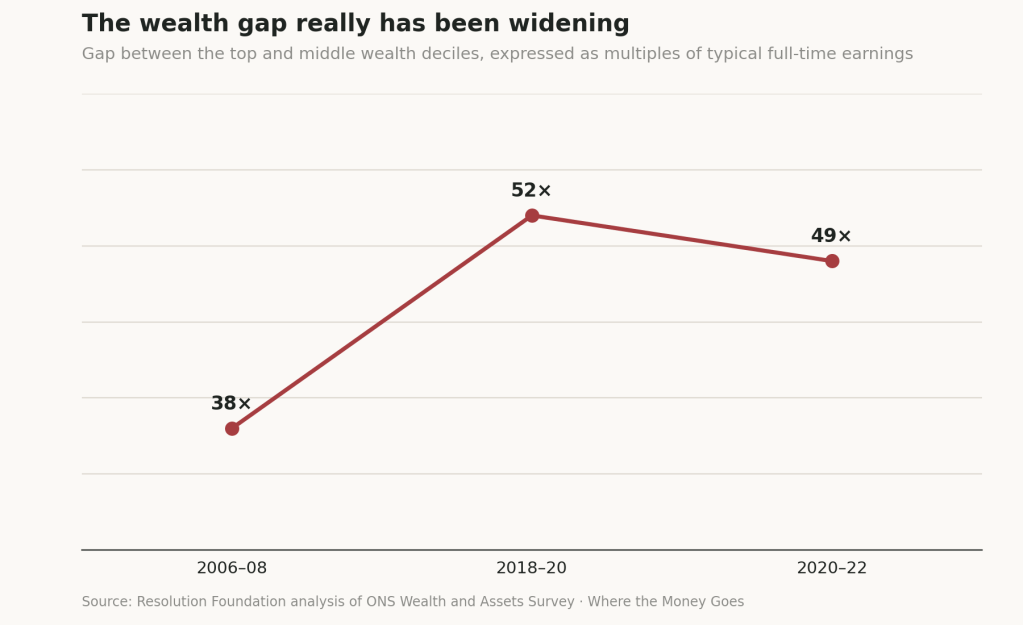
- But two other divides kept widening quietly. Place: London and the South East’s share of the economy keeps growing, and the regional spread beneath that headline is far starker than “London vs the rest” suggests. Assets: the wealth gap between the top and middle deciles has grown from 38 times typical earnings to 52 times since 2006. The concentration didn’t show up in income — it showed up in geography and in what people own.
1. Size and standing
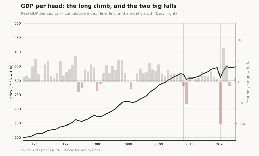
- The economy has grown roughly fivefold since 1956, but not smoothly. Two major shocks — 2008 (GFC) and 2020 (COVID) — together with the mid 1970s oil price impact and early 1980s and 1990s recessions – stand out sharply against seventy years of otherwise steady climb.
- The UK remains the world’s fifth-largest economy by nominal GDP, though only around 21st by GDP per capita — a reminder that aggregate size and average prosperity are different measures answering different questions.
- “Fastest growing in the G7” and “stagnant” have both been true within the same twelve months. Quarter-to-quarter growth comparisons are easily cherry-picked in either direction; the honest picture needs the whole decade, not the whole quarter.
World’s 20 Largest Economies by Nominal GDP
| Rank | Country | IMF (2026, $m) | World Bank (2024, $m) | UN (2024, $m) |
|---|---|---|---|---|
| 1 | United States | 32,383,920 | 28,750,956 | 29,298,000 |
| 2 | China | 20,851,593 | 18,743,803 | 18,743,802 |
| 3 | Germany | 5,452,858 | 4,685,593 | 4,659,929 |
| 4 | Japan | 4,379,253 | 4,027,598 | 4,026,211 |
| 5 | United Kingdom | 4,264,794 | 3,686,033 | 3,685,881 |
| 6 | India | 4,153,191 | 3,909,892 | 3,952,244 |
| 7 | France | 3,596,094 | 3,160,443 | 3,160,443 |
| 8 | Italy | 2,738,164 | 2,380,825 | 2,380,825 |
| 9 | Russia | 2,656,452 | 2,173,836 | 2,173,386 |
| 10 | Brazil | 2,635,912 | 2,185,822 | 2,185,822 |
| 11 | Canada | 2,507,340 | 2,243,637 | 2,270,076 |
| 12 | Australia | 2,123,963 | 1,757,022 | 1,830,610 |
| 13 | Mexico | 2,120,855 | 1,856,366 | 1,852,723 |
| 14 | Spain | 2,091,222 | 1,725,672 | 1,722,746 |
| 15 | South Korea | 1,931,008 | 1,875,388 | 1,875,388 |
| 16 | Turkey | 1,640,223 | 1,359,124 | 1,323,255 |
| 17 | Indonesia | 1,539,872 | 1,396,300 | 1,396,300 |
| 18 | Netherlands | 1,449,704 | 1,214,928 | 1,214,928 |
| 19 | Saudi Arabia | 1,388,676 | 1,239,805 | 1,254,141 |
| 20 | Switzerland | 1,146,911 | 936,564 | 936,564 |
Source: IMF World Economic Outlook (April 2026), World Bank, and UN Statistics Division — Wikipedia’s compiled comparison, current as of this year.
2. What the economy is made of
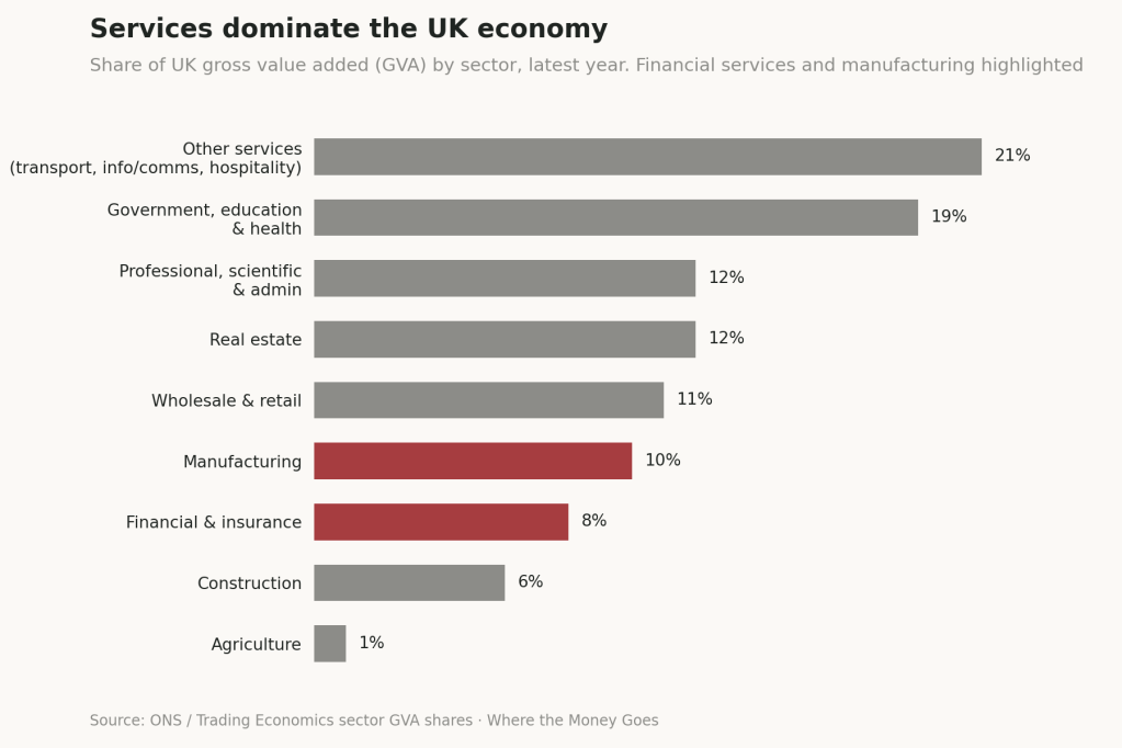
- Services dominate absolutely. Government, education and health; real estate; professional and administrative services; wholesale and retail — together these dwarf industry and agriculture combined.
- Financial and insurance services alone contribute roughly as much to GDP as the entire manufacturing sector, on a fraction of the employment. That’s the empirical anchor for any argument about financialisation — not an assertion, a measurable proportion.
- The UK runs a persistent trade deficit — household consumption accounts for roughly 65% of GDP, against exports of 28% and imports of 30%.
3. The productivity puzzle
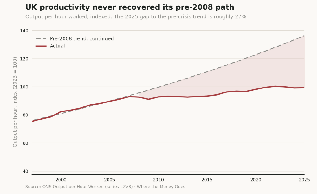
- Productivity never recovered its pre-2008 trajectory. Output per hour worked sits roughly 27% below where the pre-crisis trend implied it would be by now — independently corroborated by LSE’s own analysis, which put the gap at 24%.
- This is the single most important line in the whole piece. Almost everything downstream — wages, tax revenue, the capacity to fund public services — traces back to this line failing to bend back upward.
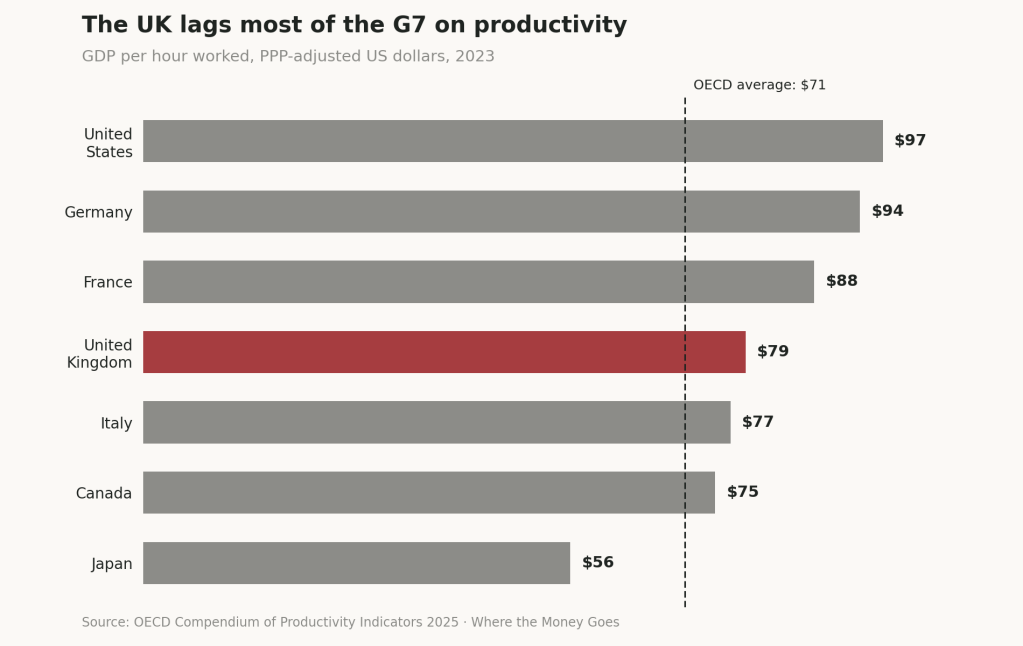
- The UK ranks fourth in the G7 on output per hour, around 18% below the United States, and 31st out of 35 OECD countries on productivity growth in the decade after the crash.
4. Labour market
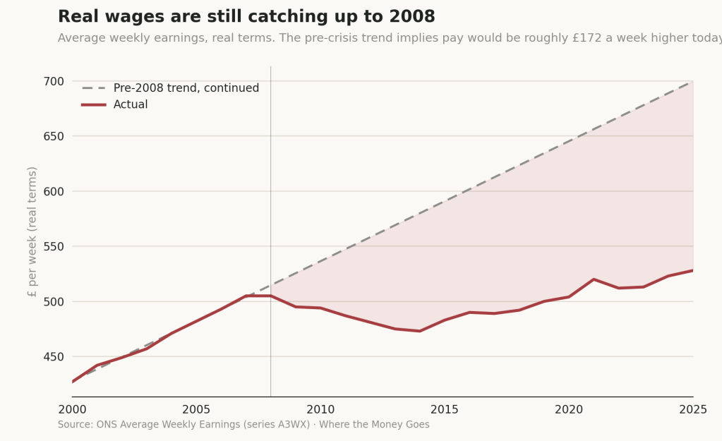
- Real wages are still catching up to where they stood before the crash. The pre-2008 earnings trend implies pay should be roughly £170 a week — about £8,900 a year — higher than it currently is.
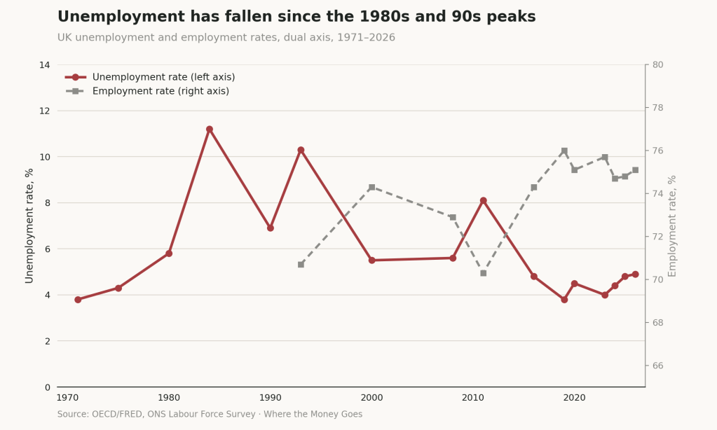
- Employment itself looks healthy on the headline numbers: 75.0% employment, 4.9% unemployment, both broadly stable on the year. The wage story is not an employment story — people are working, and still short.
- Youth unemployment sits at a decade high of 16.2%, a specific and separate strain from the headline figures.
5. Where it sits geographically
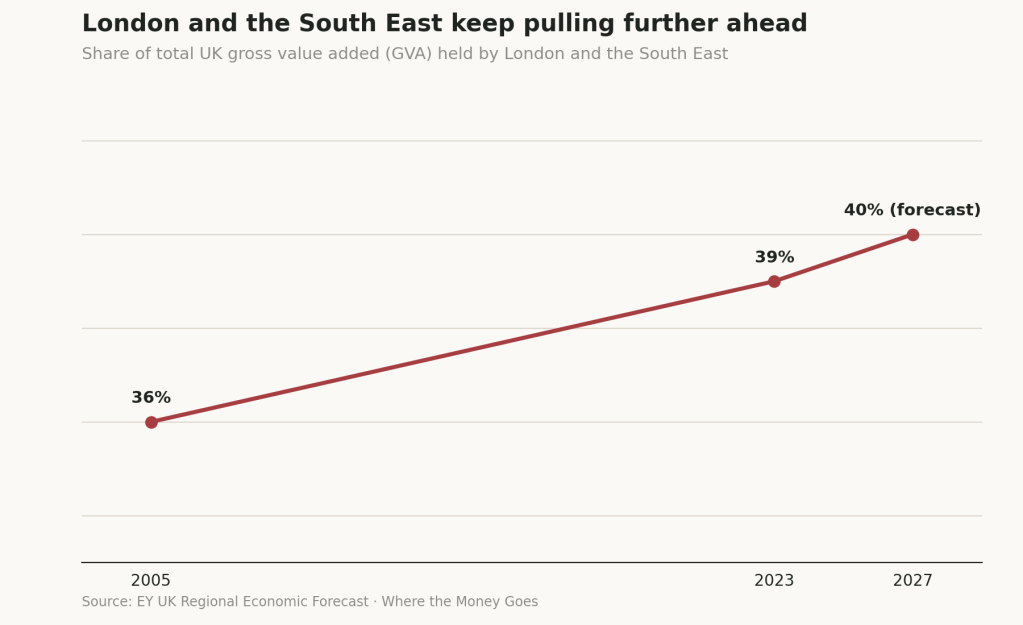
- London and the South East’s share of total UK economic output keeps climbing — from 36% in 2005 to 39% now, forecast to reach 40% by 2027. This is a drift, not a snapshot, and it has been consistent for two decades.
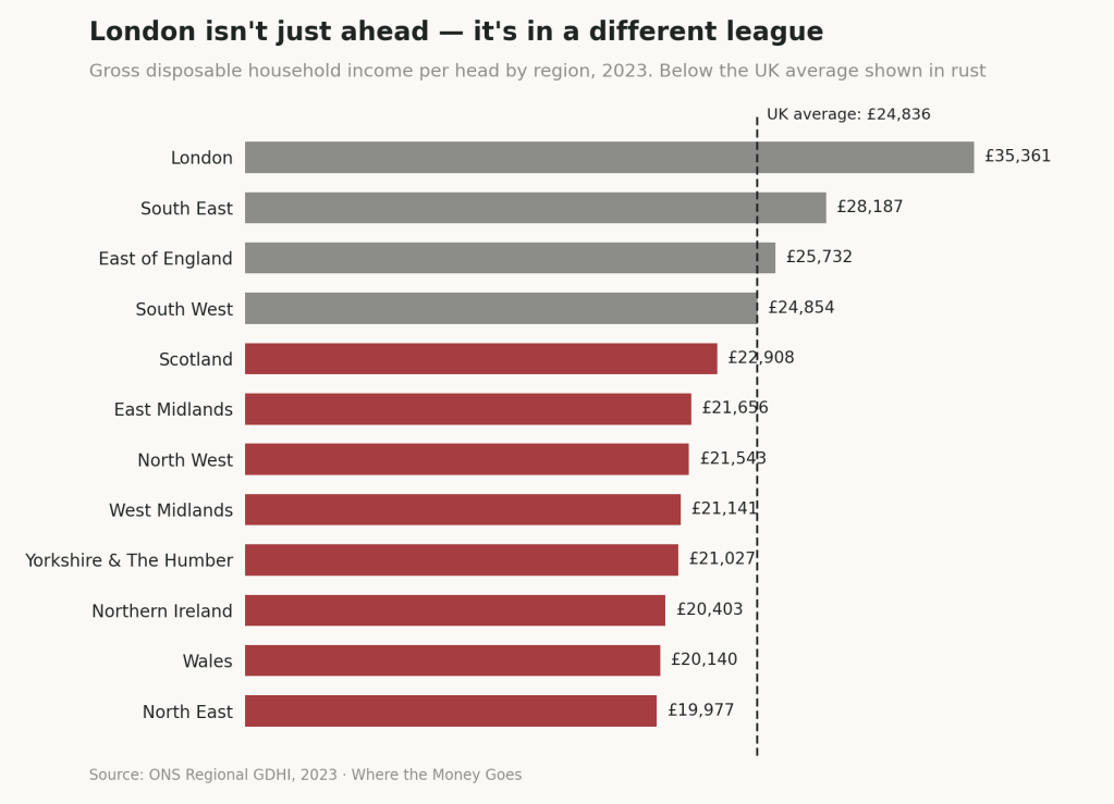
- The gap is not simply “London vs everywhere else.” Regional household income ranges from £19,977 per head in the North East to £35,361 in London, against a UK average of £24,836 — London isn’t just ahead, it sits in a different bracket entirely.
- Productivity growth in London itself has stalled since 2008 (up just 1.5% in real terms, 2008–2021, against 6.9% for the UK as a whole) even as London’s overall economic weight keeps rising — a reminder that regional concentration and regional dynamism are not the same thing.
6. Who has what
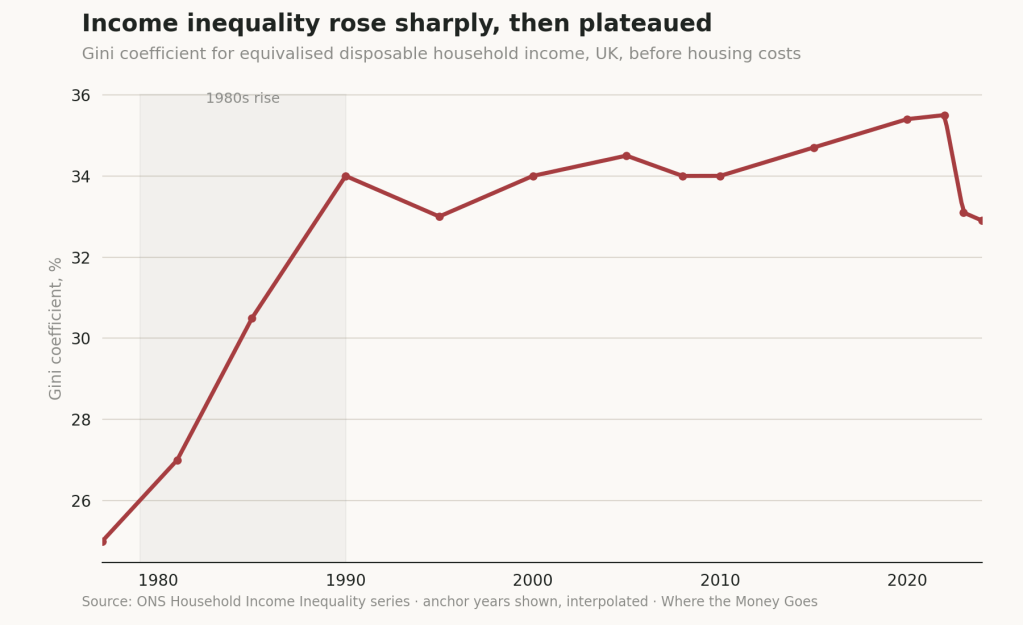
- Income inequality rose sharply through the 1980s, then plateaued. The Gini coefficient for household income has been broadly flat since 1990 — including through 2008. This is the finding most likely to surprise a reader who assumes inequality has been steadily worsening on every measure; it hasn’t, not on this one.
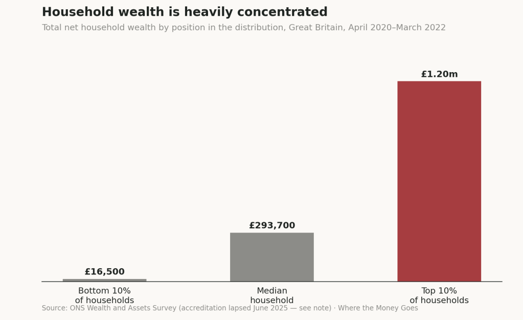
- Wealth tells a different story entirely. The top 10% of households hold average wealth of £1.2 million or more; the bottom 10% hold £16,500 or less.
- And unlike income, the wealth gap really has been widening. The gap between the top and middle wealth deciles grew from 38 times typical full-time earnings in 2006–08 to 52 times by 2018–20, before easing slightly to 49 times in 2020–22 — a genuine, measured acceleration that has plateaued at a far higher level than it started, not a straight line upward but not a reversal either.
A note on the data
Most of this piece rests on primary ONS series — GDP, productivity, earnings, regional GVA and GDHI, and the Wealth and Assets Survey — supplemented by Resolution Foundation and IFS analysis where it adds interpretive value. Two things worth flagging plainly: the Gini trend line is drawn through real anchor years but interpolated between them for visual clarity, and the ONS Wealth and Assets Survey itself lost its Official Statistics accreditation in June 2025 for insufficient quality — still the best data available, but worth an honest footnote given everything else in this piece leans on getting the sourcing right.
Next in this series: Where the Revenue Comes From — what government actually raises, and the local government finance crisis sitting underneath the headline tax figures.
 At Home He Feels Like A Tourist
Leave a comment